The concept of the corporate identity of the FC «Dinamo Minsk»
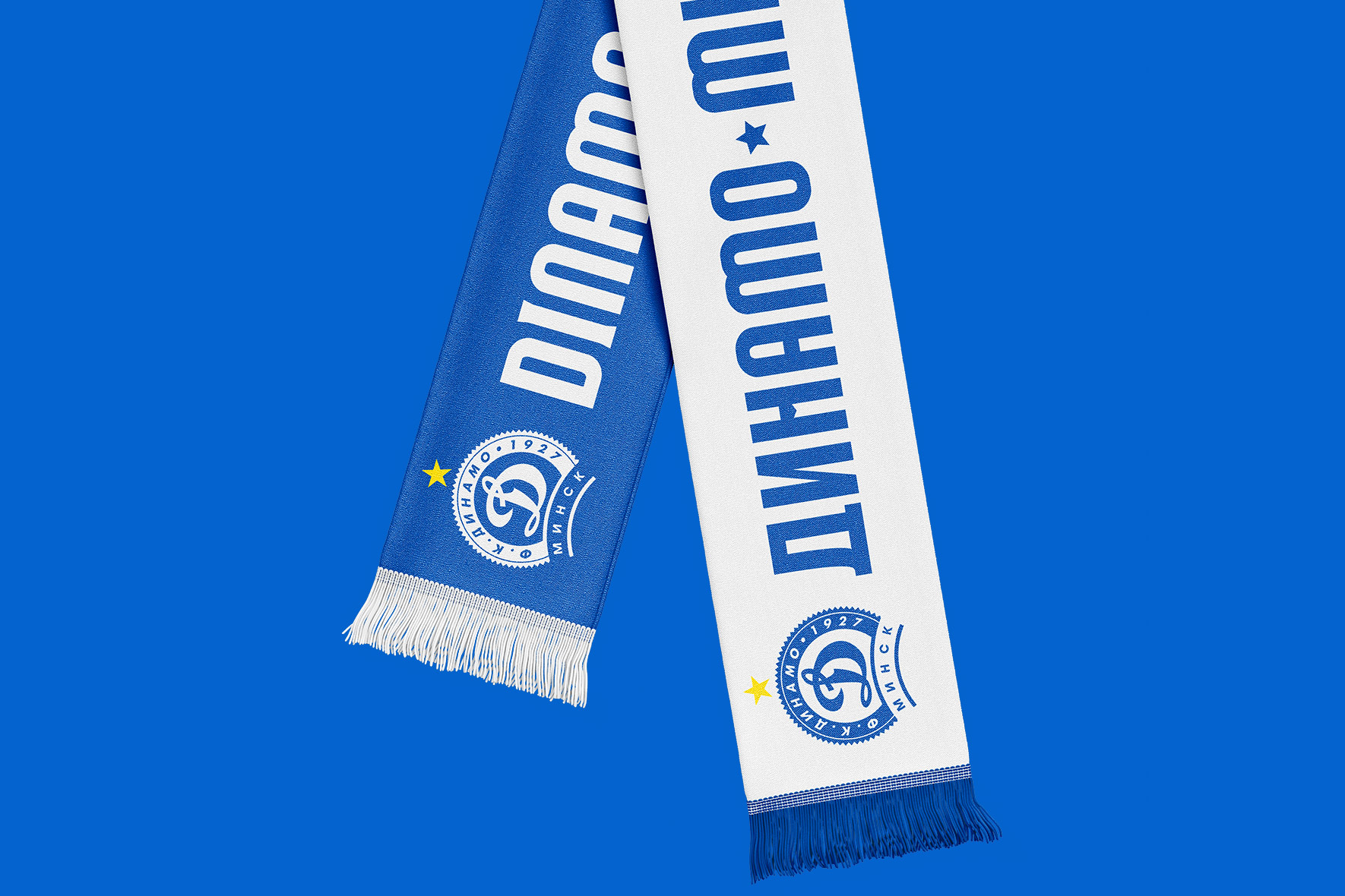
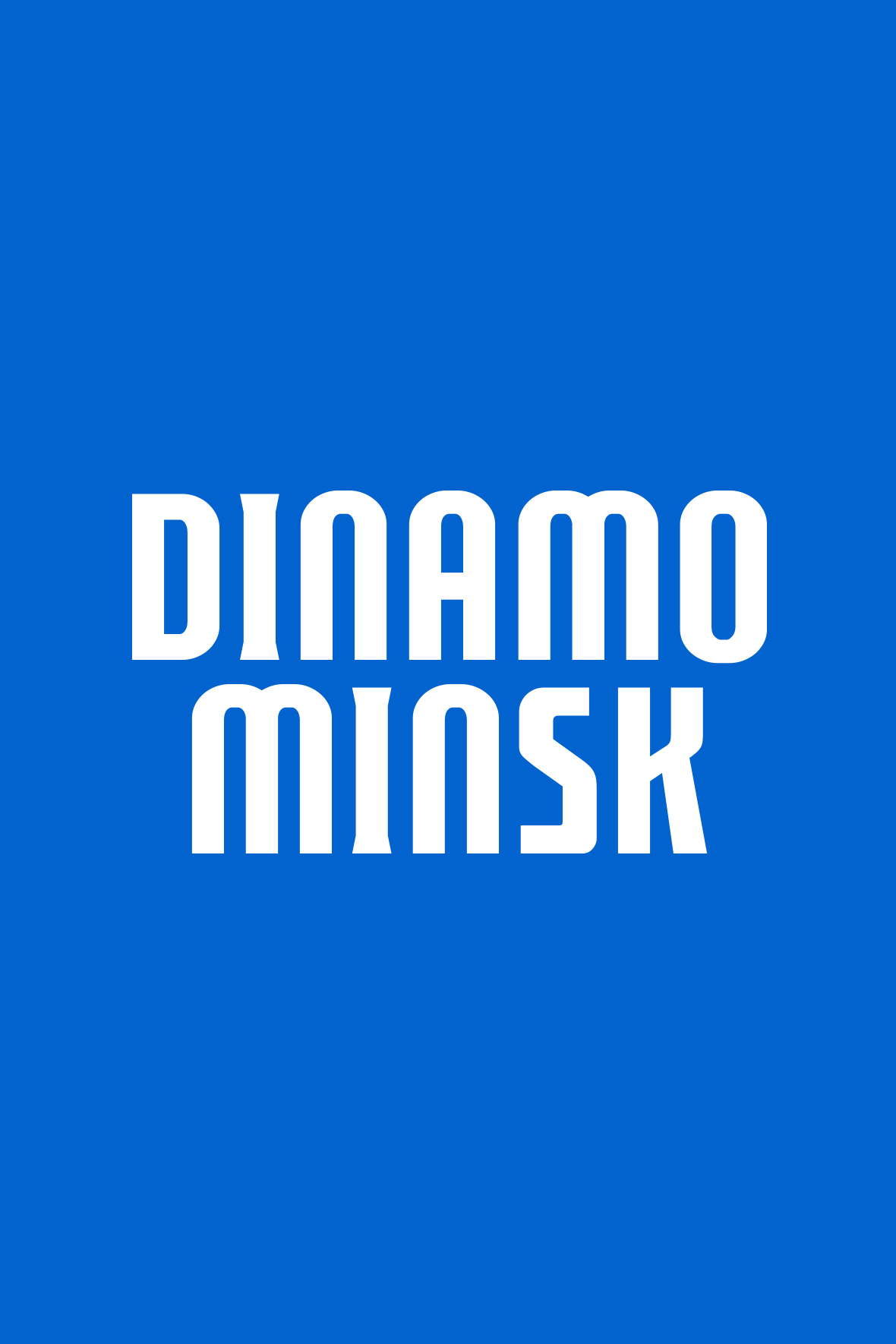
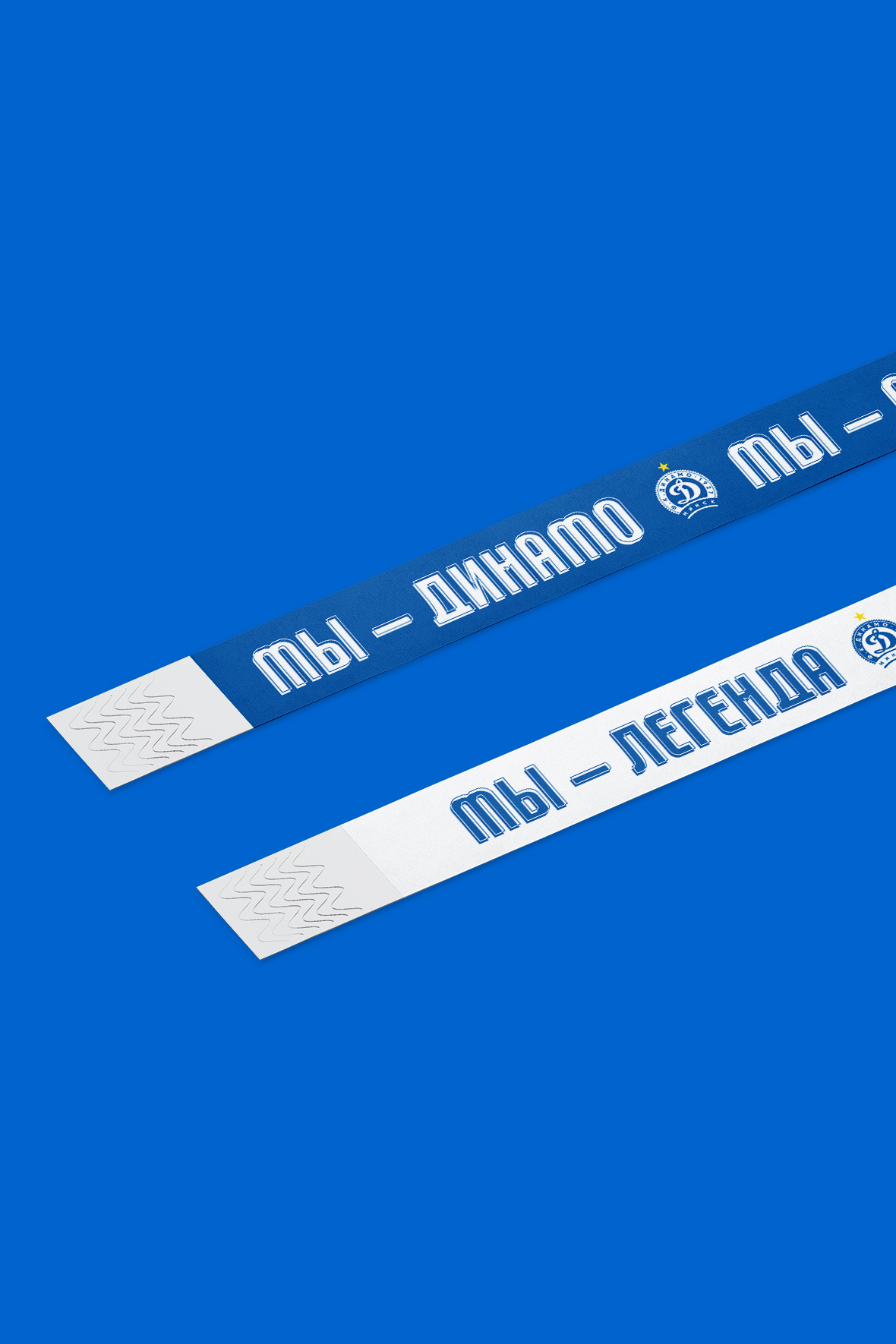
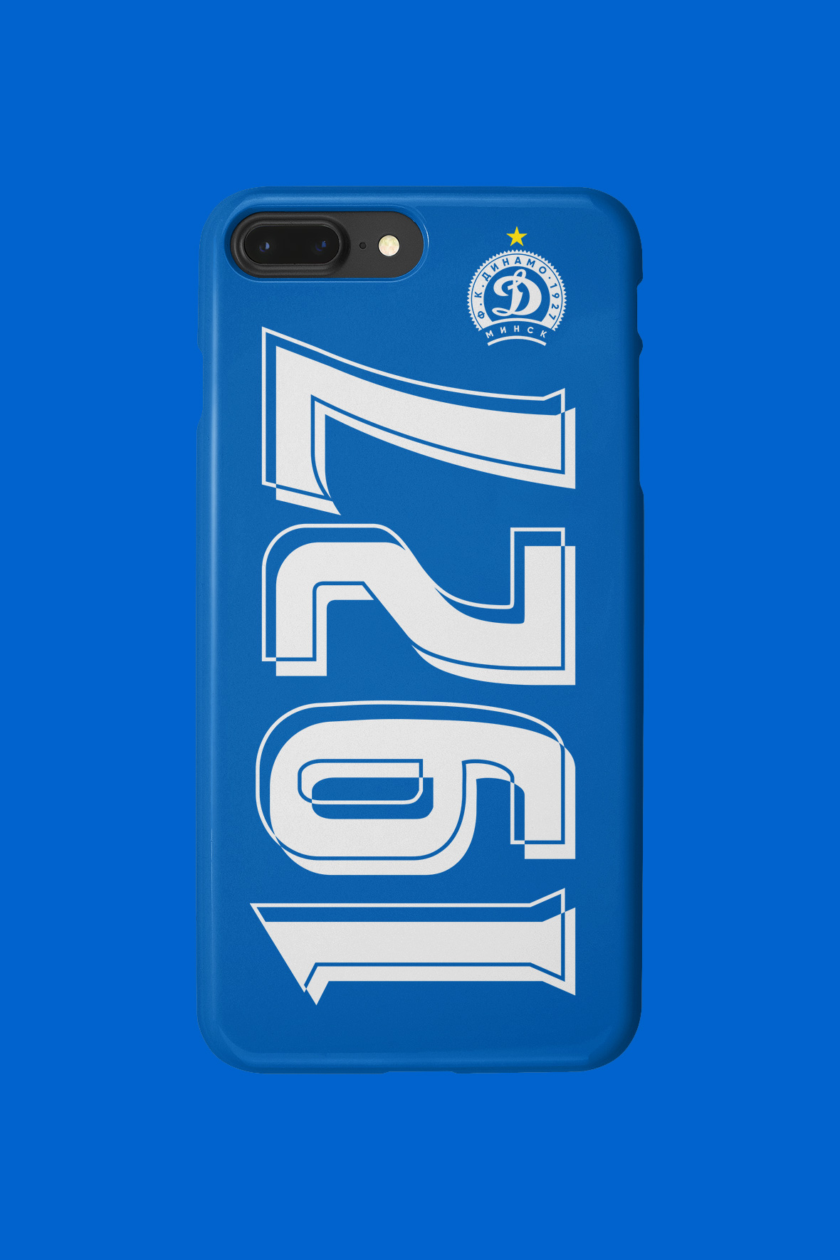
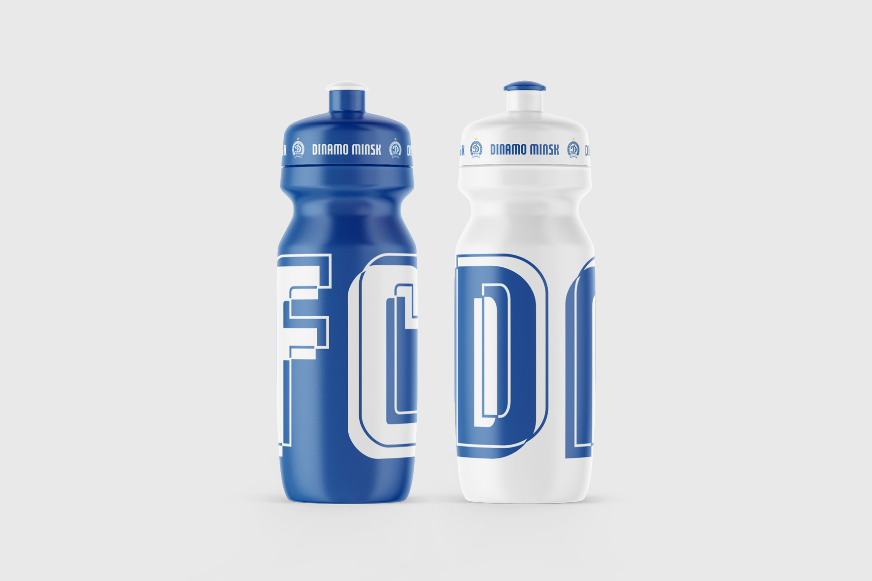
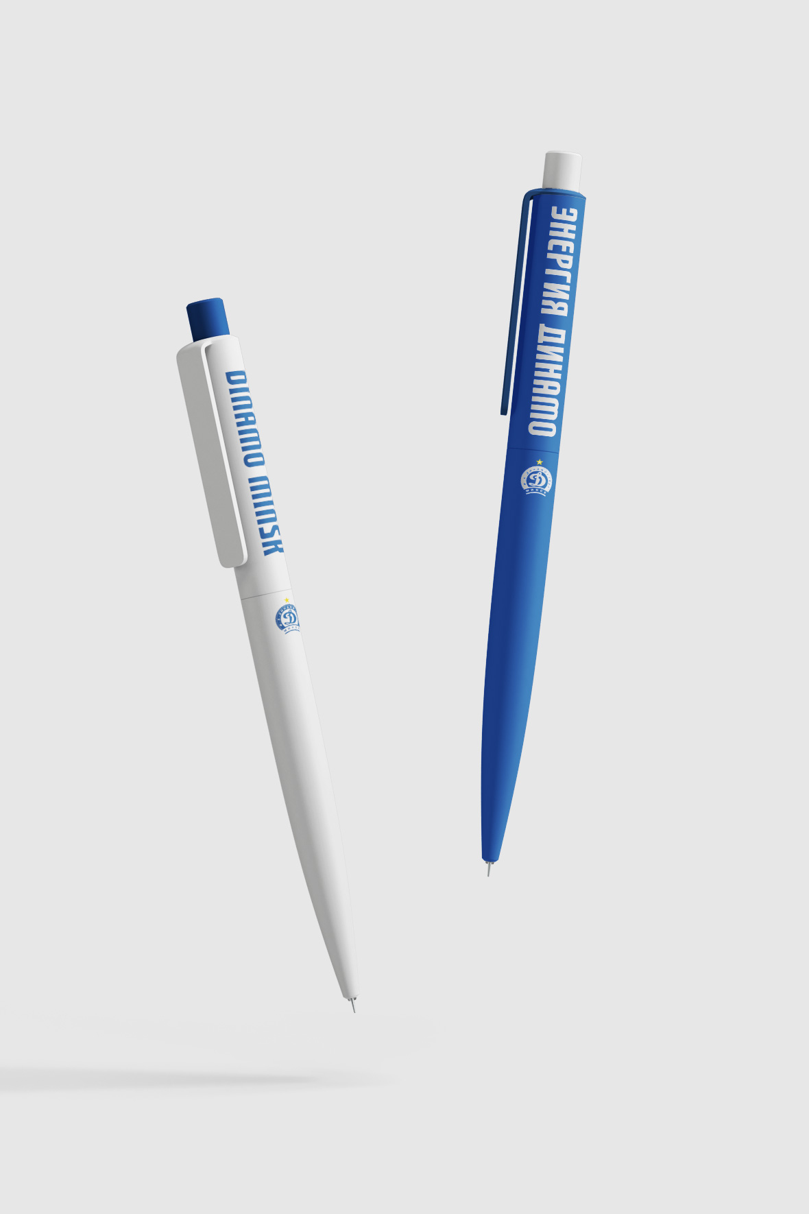
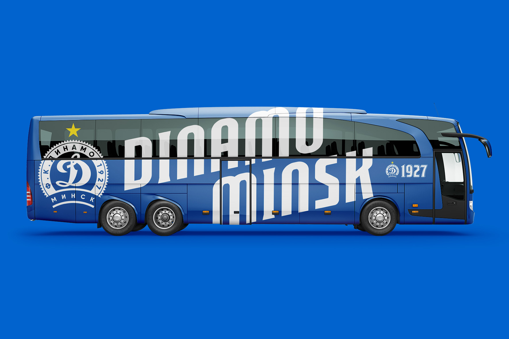
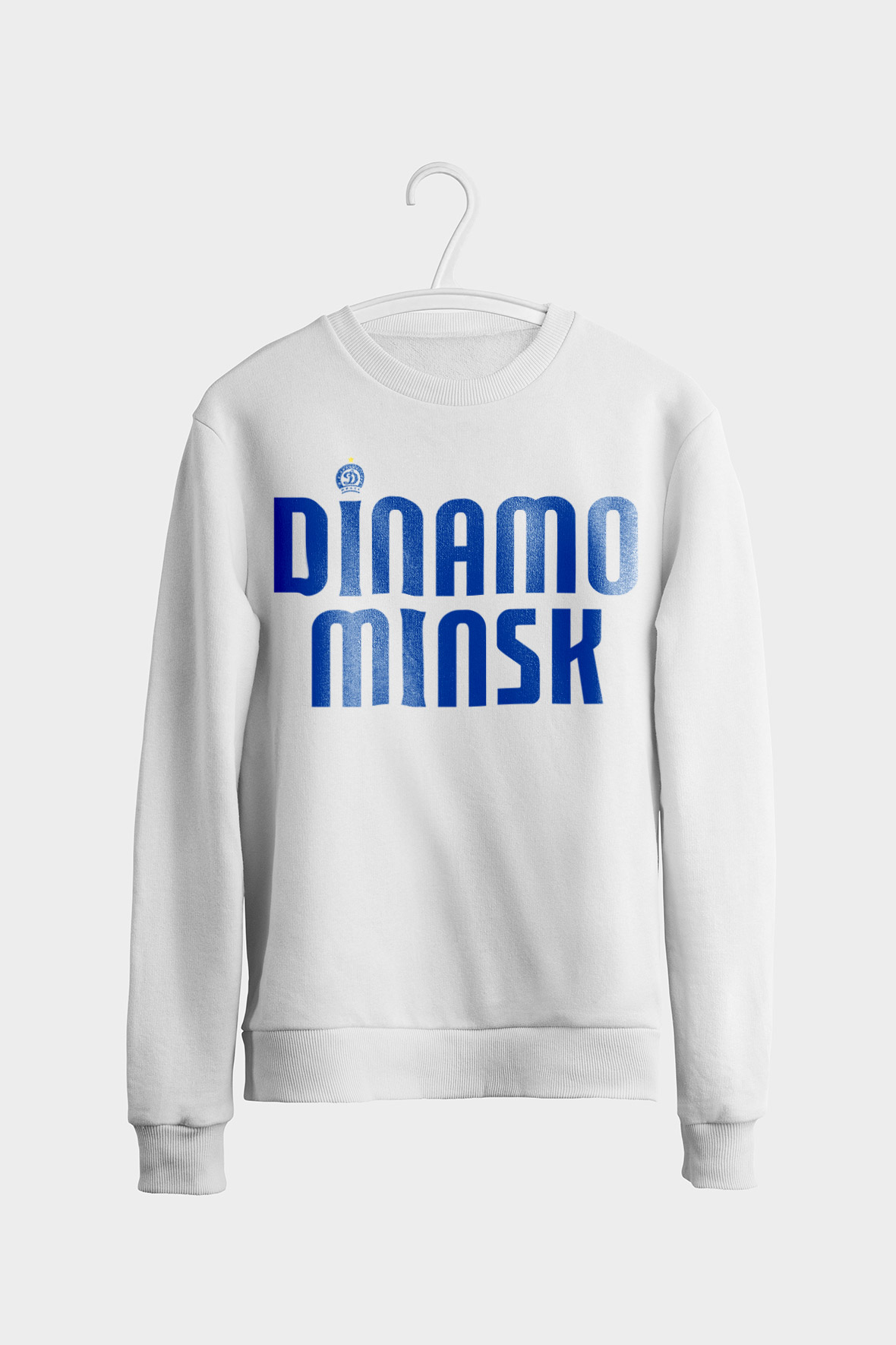
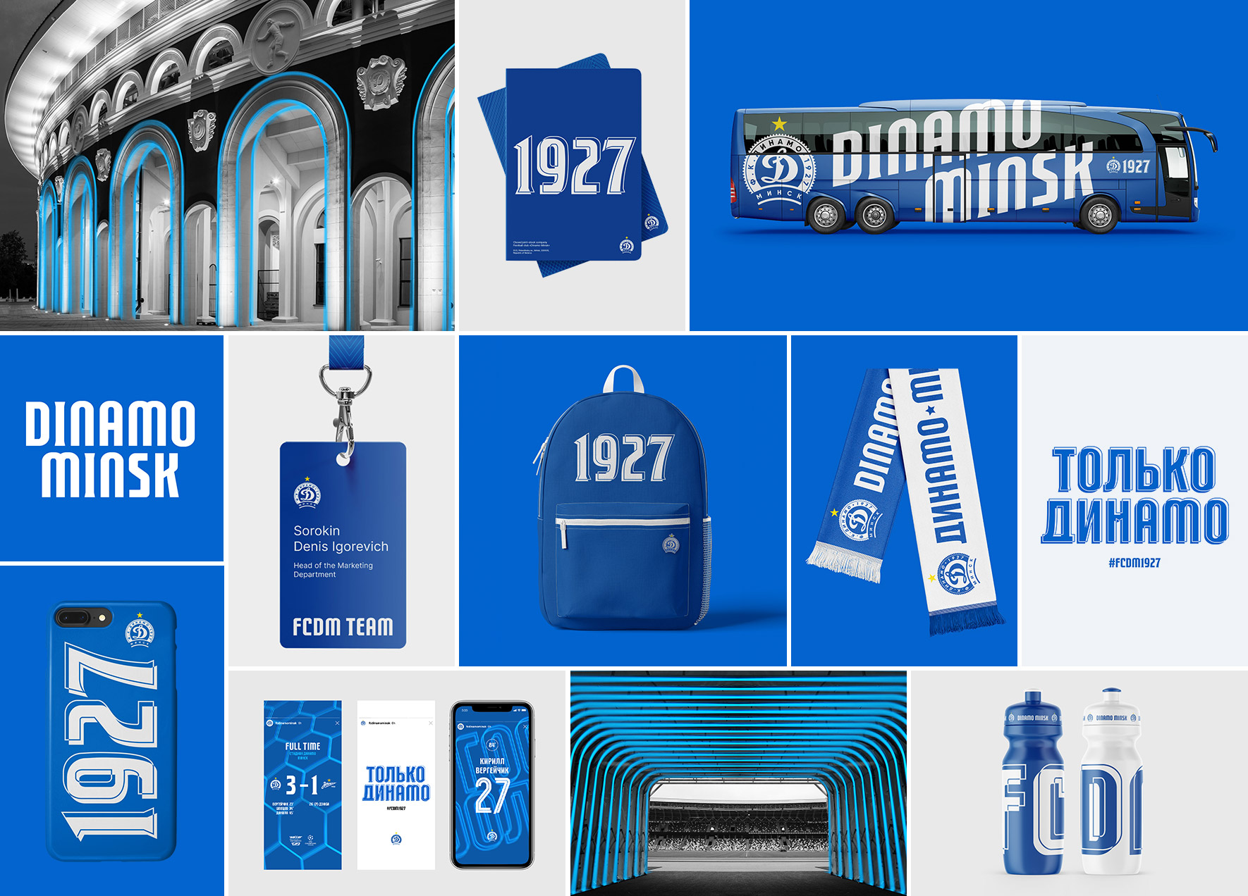
The typeface used in the headings refers to the architecture of the club’s stadium. The arches of the historical part of the stadium are easily recognizable in the lettering. The stable and laconic font looks great on media.
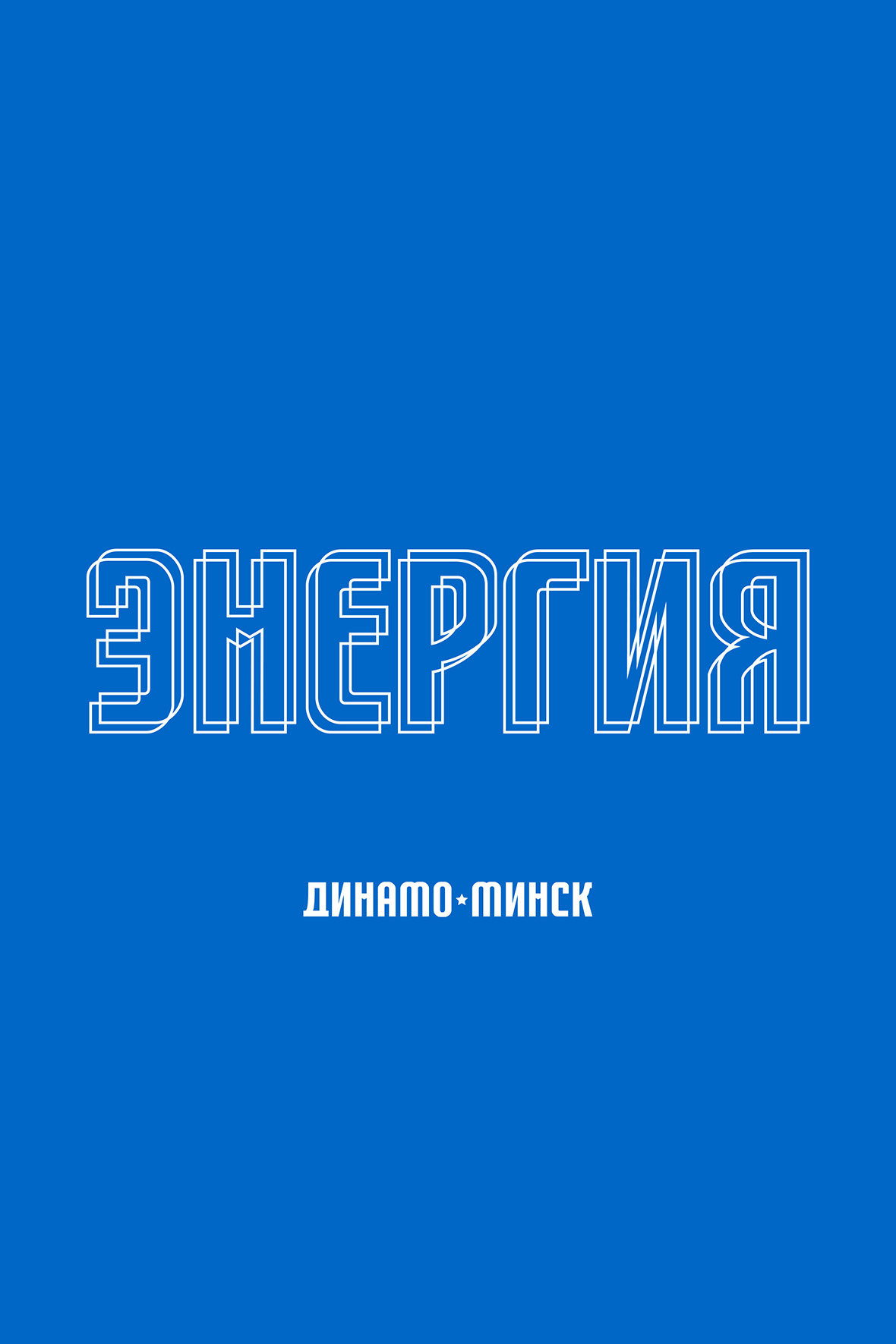
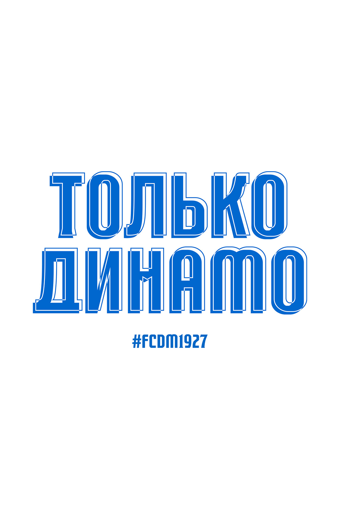
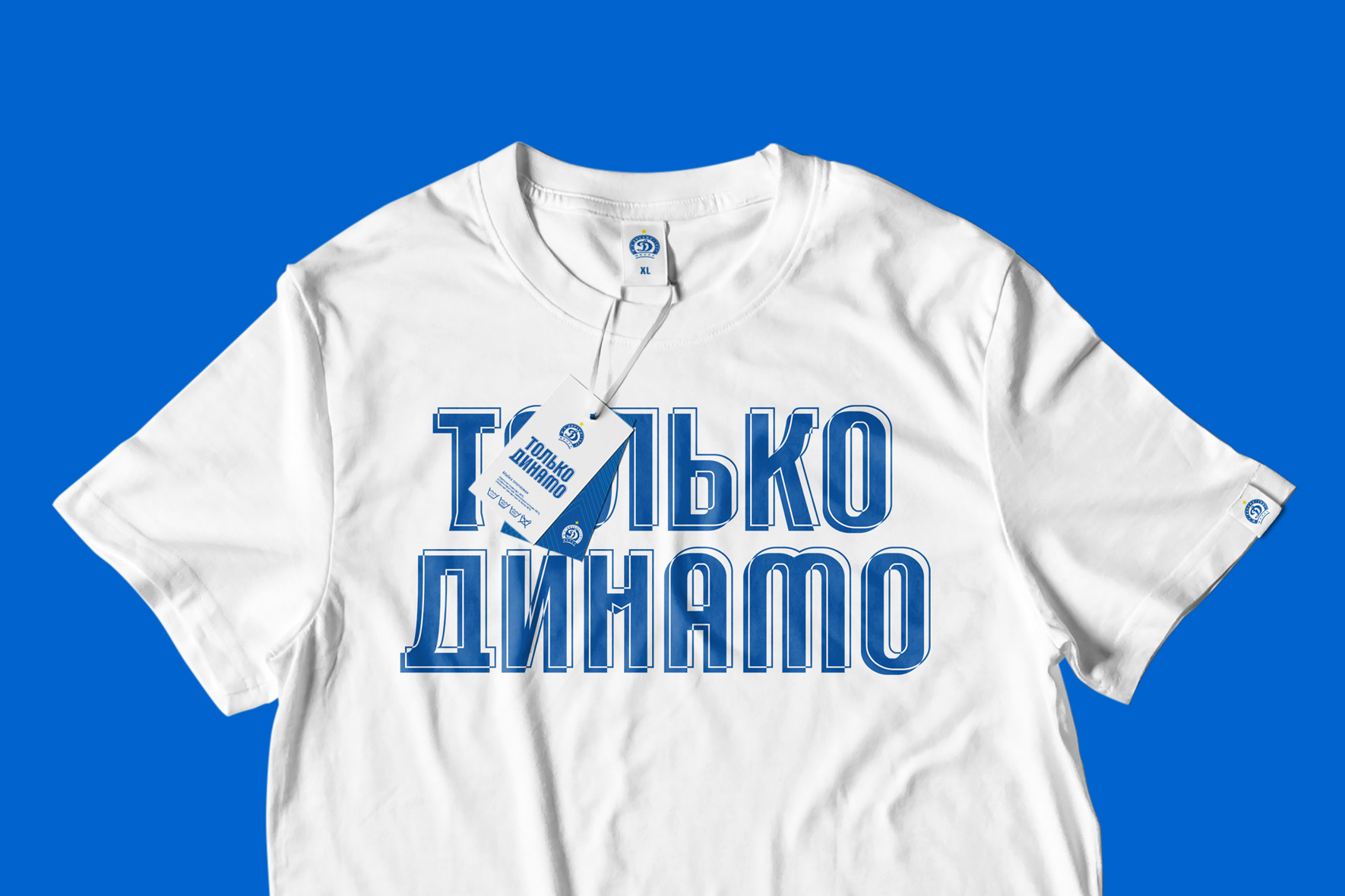
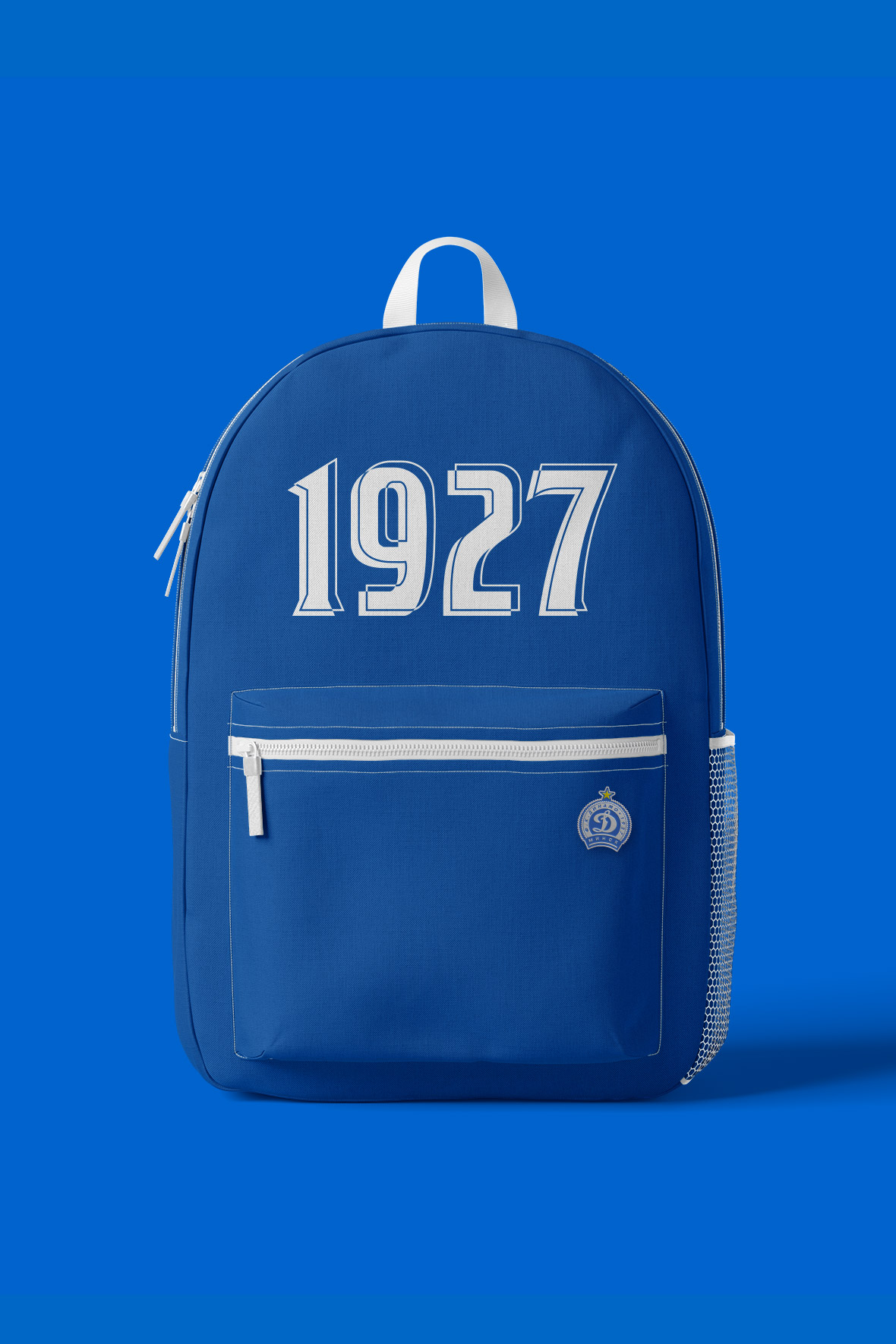
The effect of duplicating and shifting the outline adds dynamics to the lettering and serves as a bridge to the concept of an energy field. The lettering gets a unique shape – strong and unbreakable on the one hand and sharp and impulsive on the other. It symbolizes the team’s work in defense and attack.
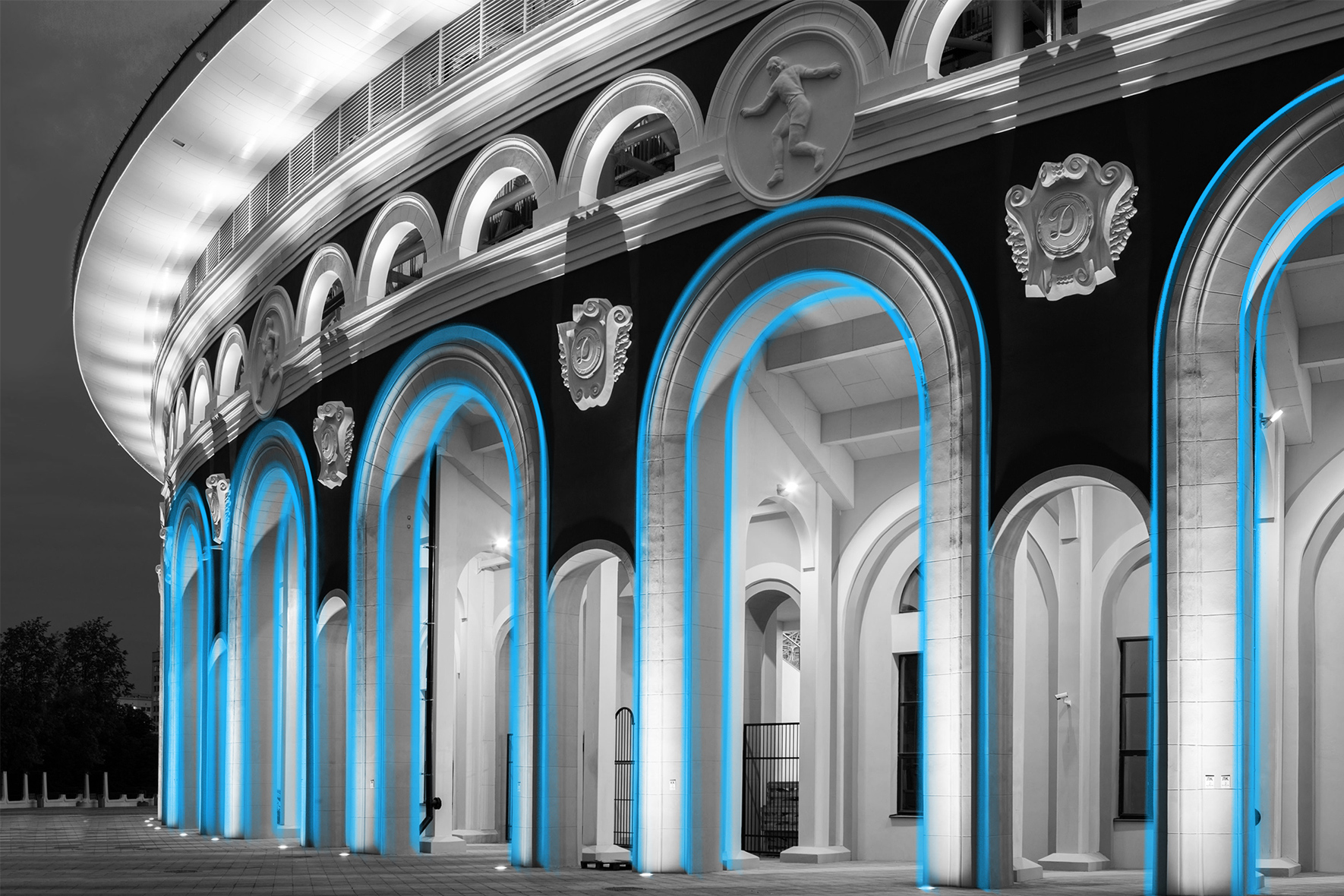
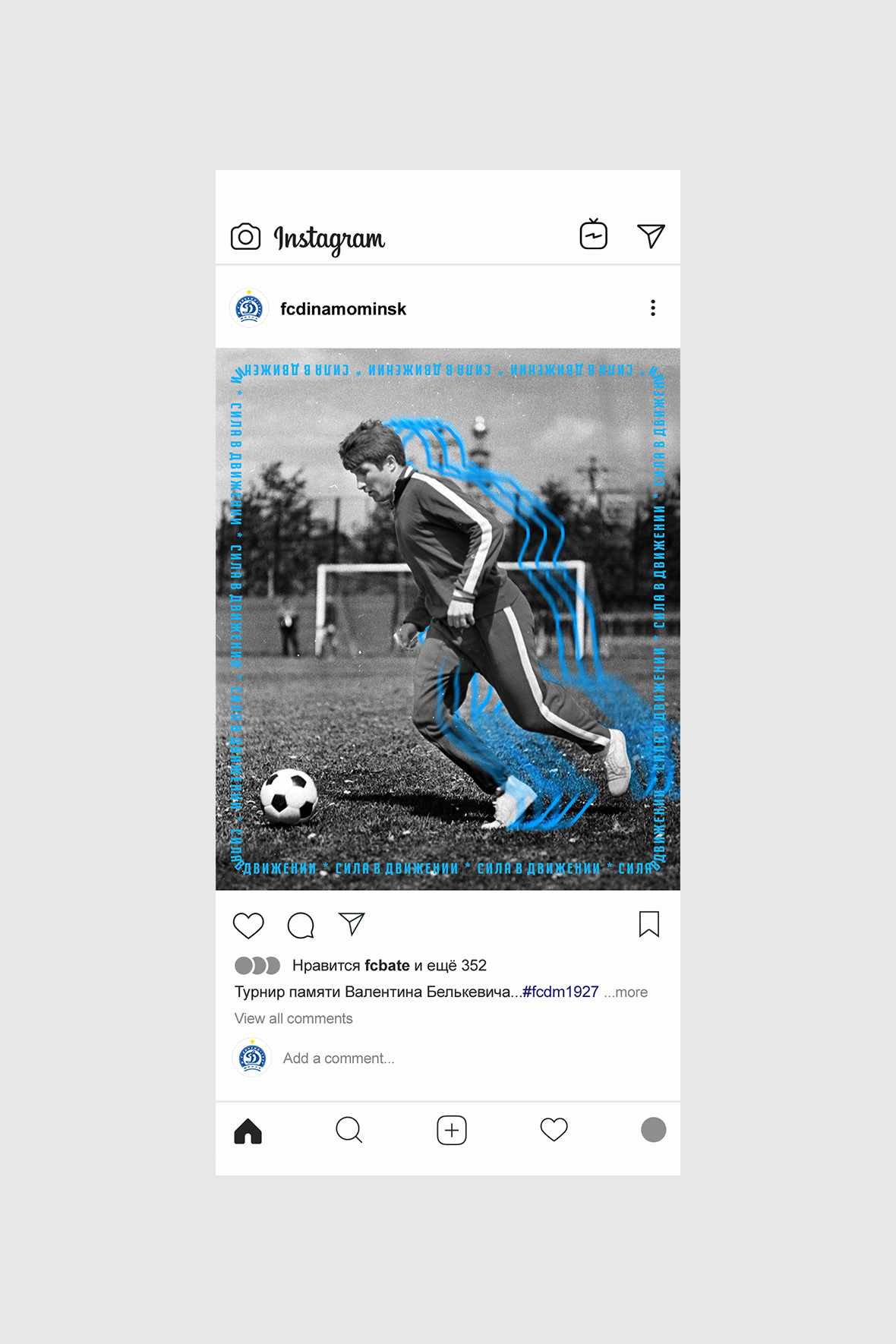
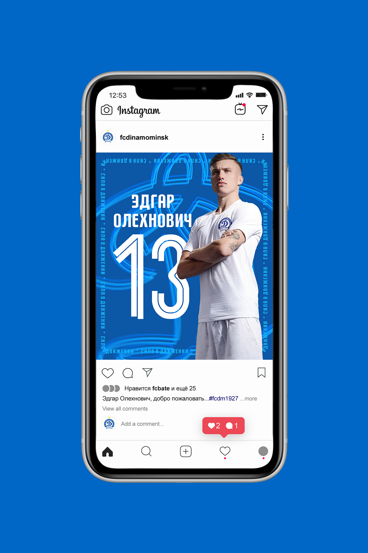
The wave effect develops in a new identity and takes on new forms. Repetitive waves create a trail of movement that allows you to focus on important points. This effect can be easily found in the geometry and architecture of the stadium.
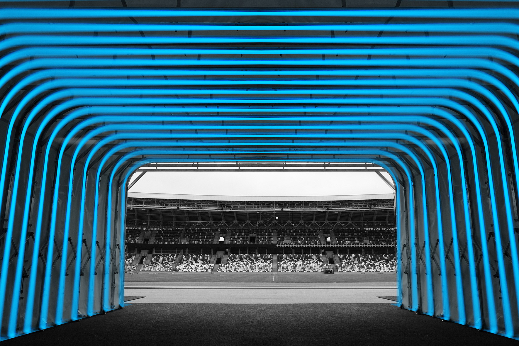
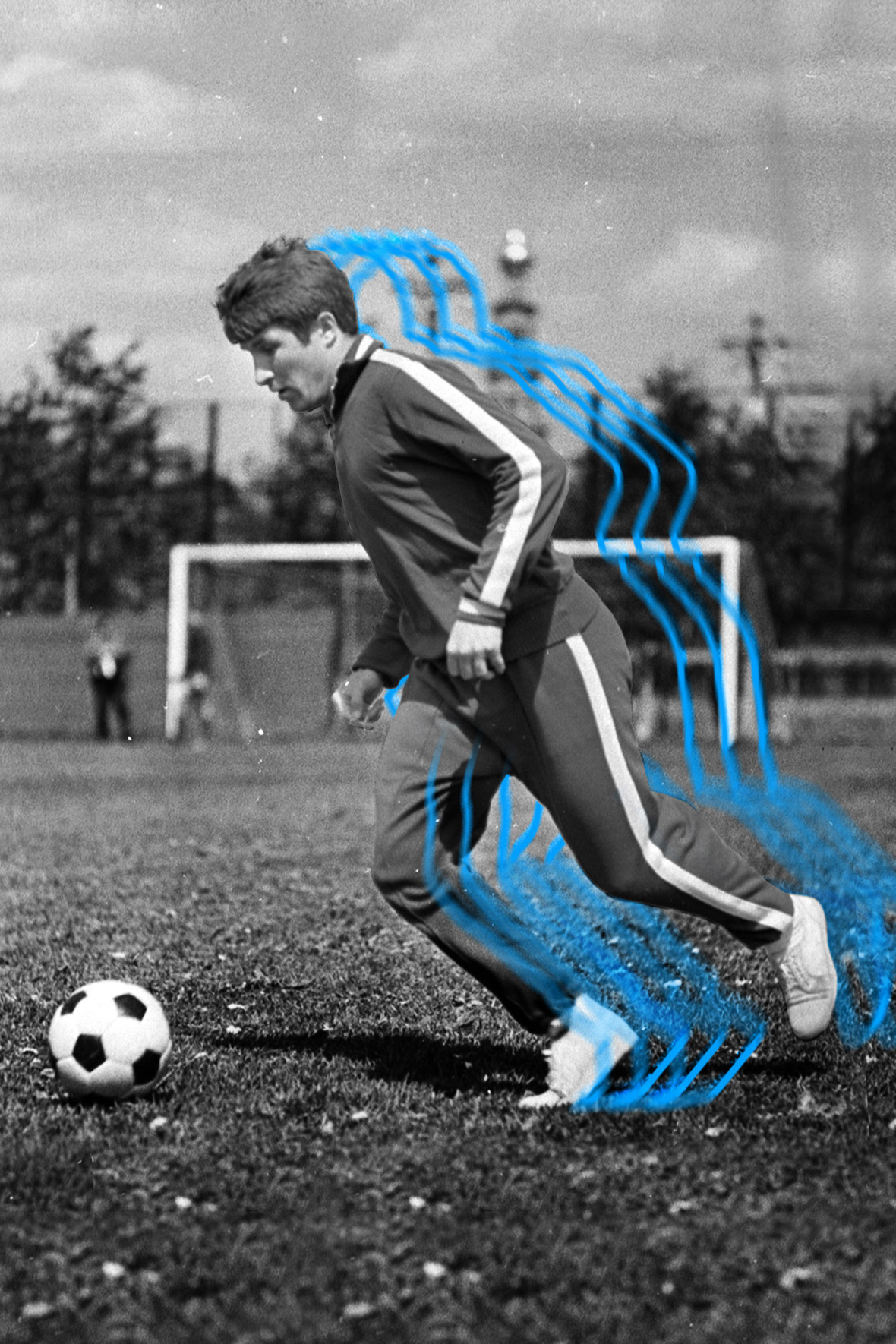
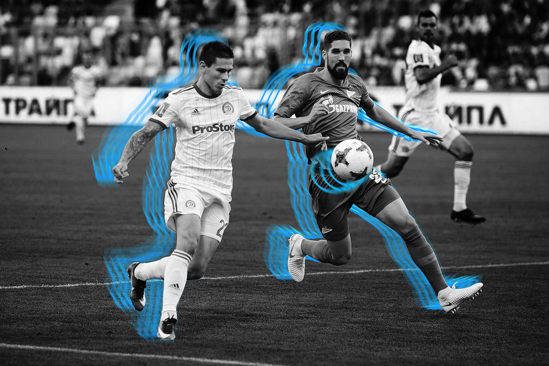
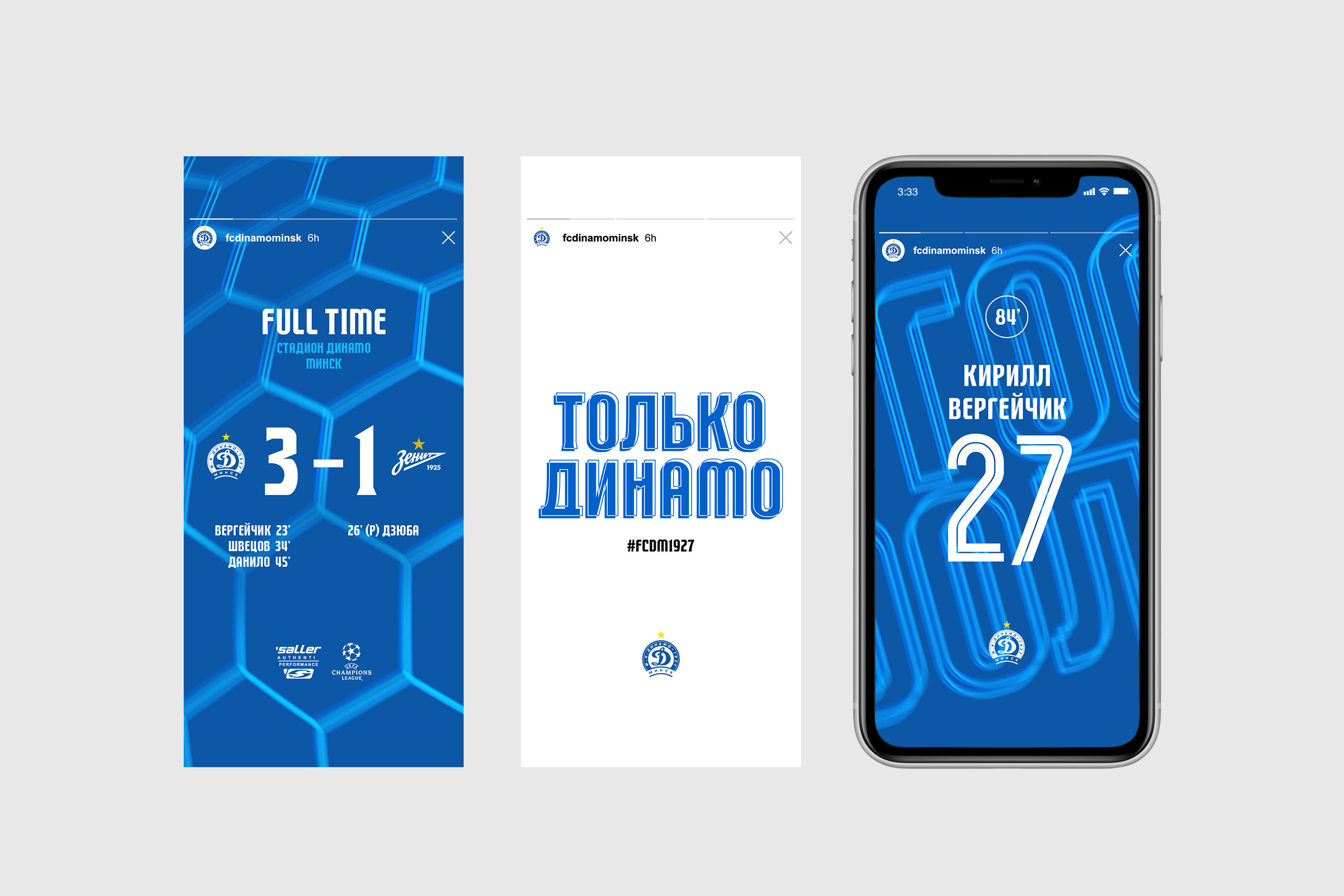
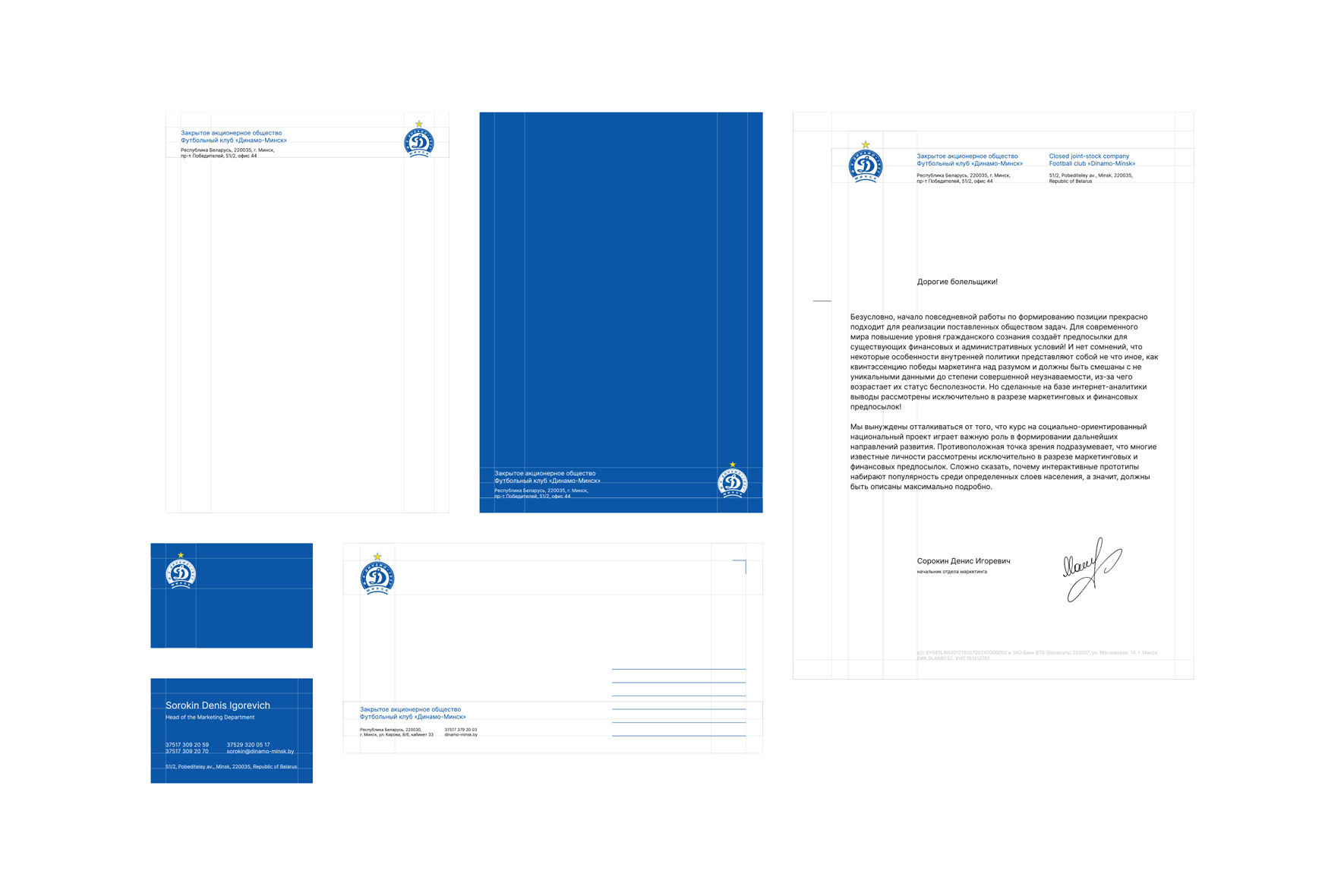
The solutions used in digital are not fully applicable in corporate identity. With all this, the general style is felt regardless of the scope of application.
Therefore, decisions in this area are based primarily on clarity, conciseness and geometric accuracy of the construction of media. This is primarily due to the different target audience of these directions. In digital, these are fans, and therefore there is a place for emotion, drive, challenge and risk.
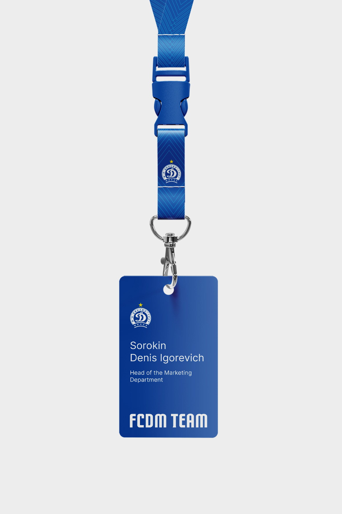
When it comes to corporate stationary (business cards, letterheads, envelopes), you need to maintain a certain level of solidity and premium. Particular emphasis is placed on printing solutions, use of designer papers and modern printing methods.
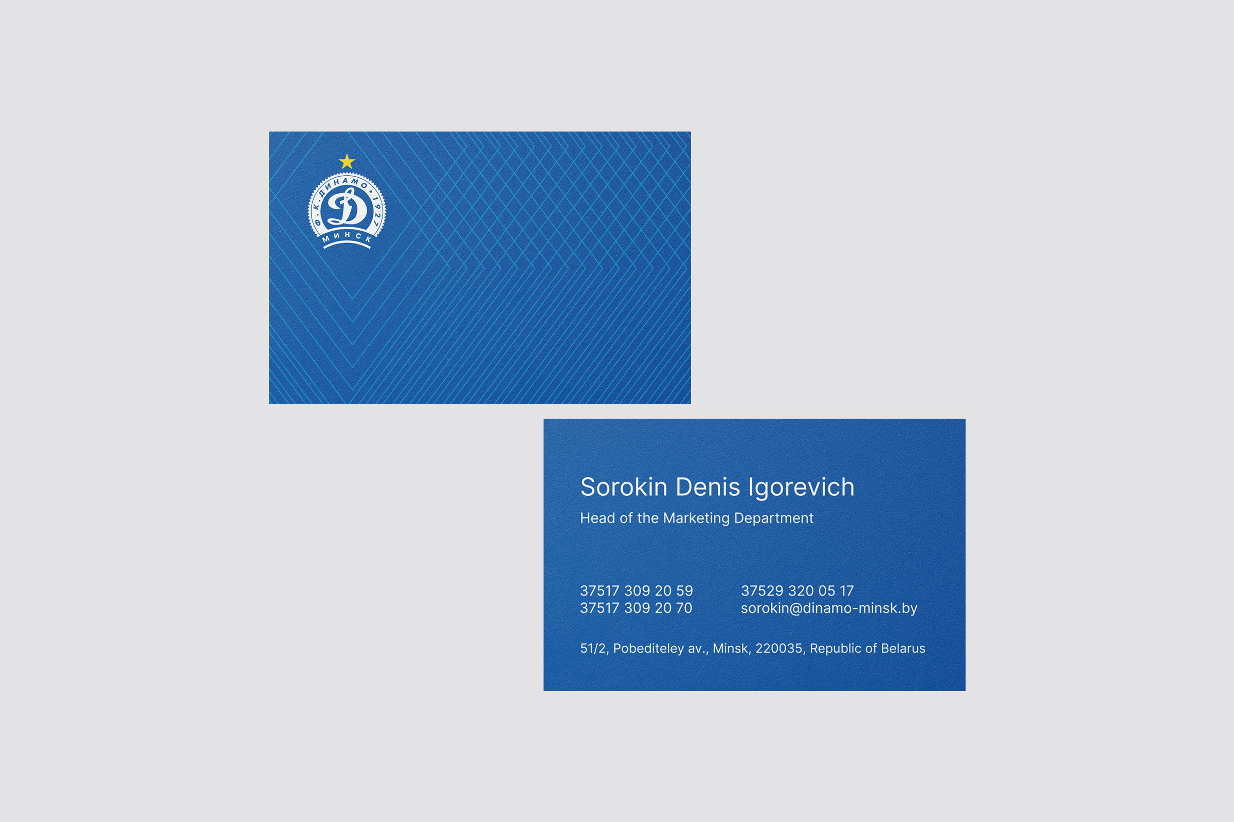
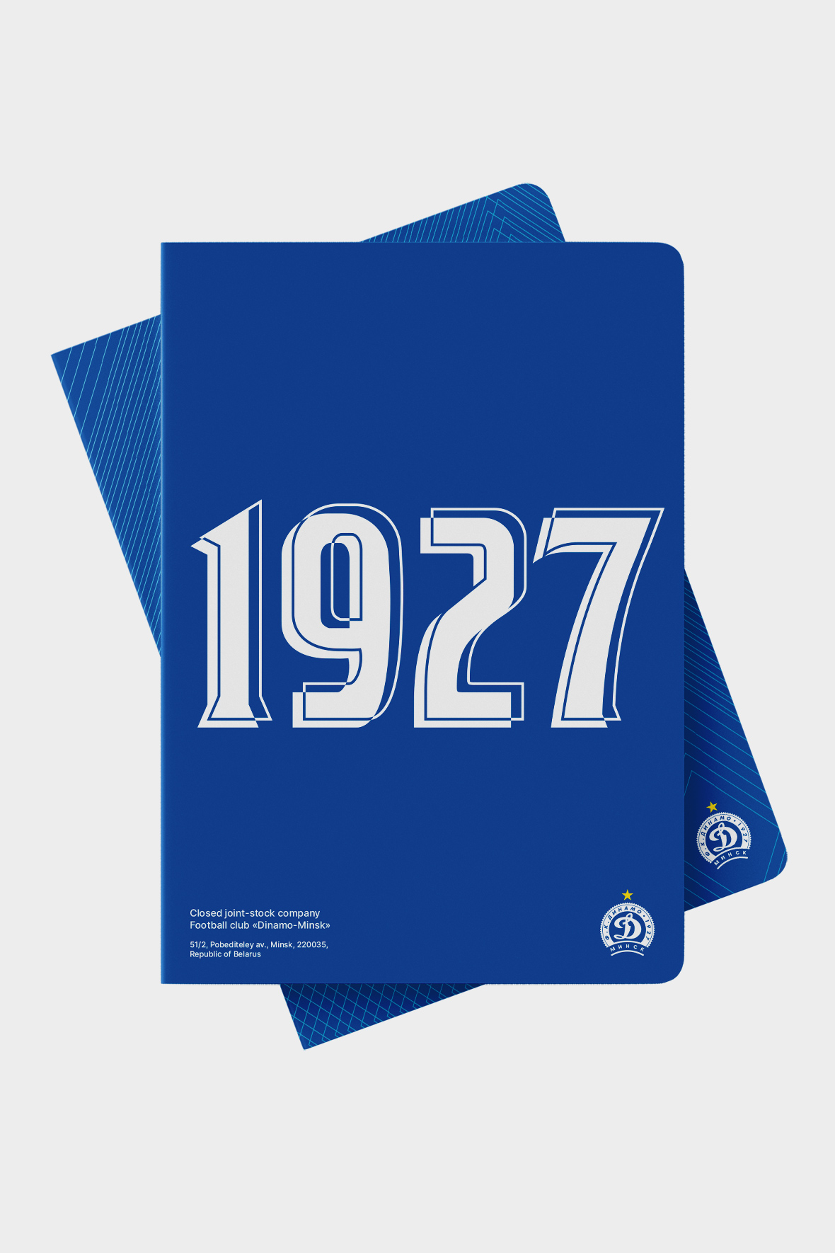
Typography takes a special place. Key slogans and facts about the club are used as style-forming elements.
Client
FC «Dinamo Minsk»
Services
Corporate branding
Identity
Date
September, 2021
Let's talk business
Fill out the form and we will contact you. As a rule, this happens during the working day.


