


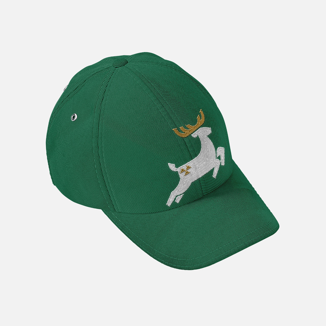
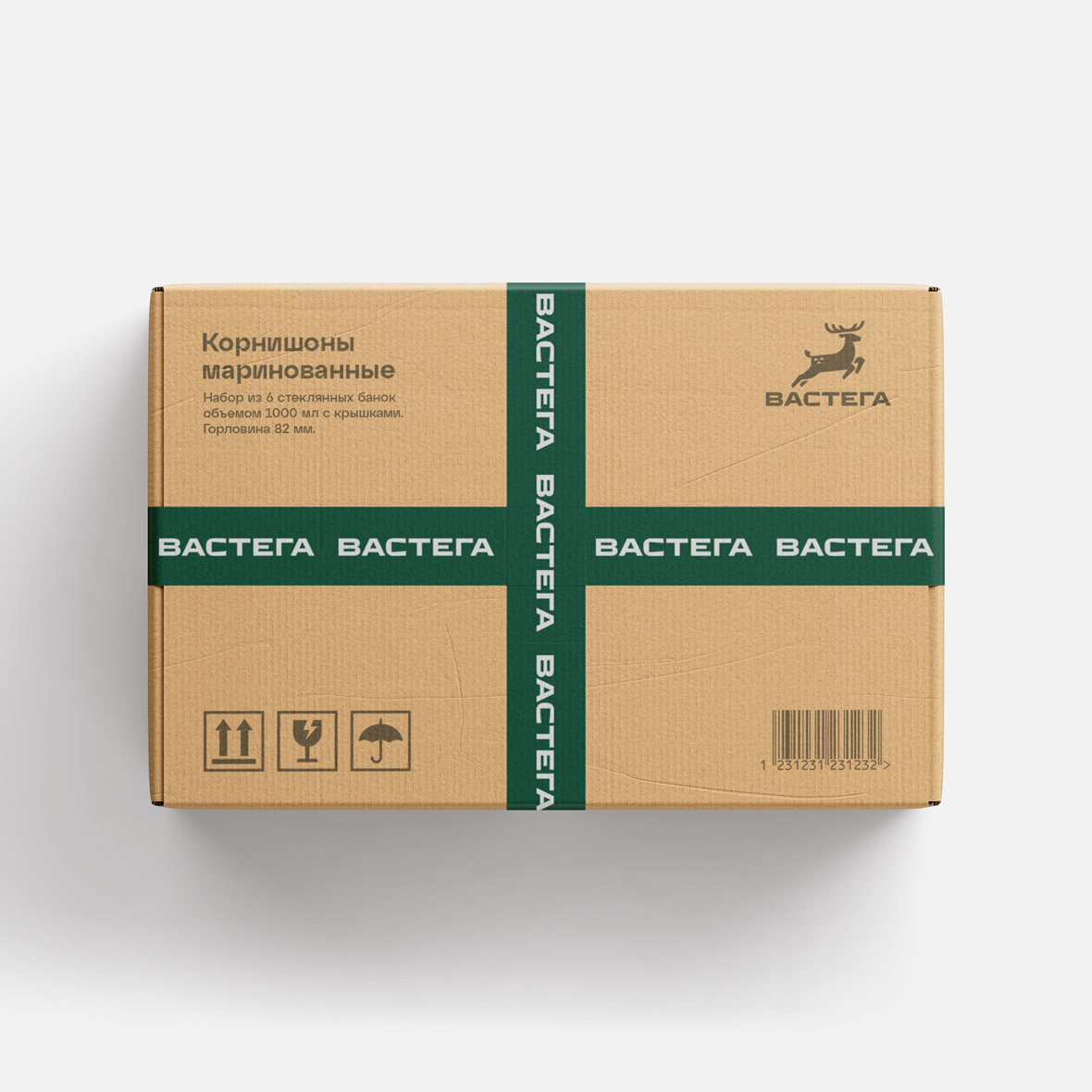
Logo redesign for a company producing canned products
Vastega is a privately owned production company producing tinned vegetables, mushrooms and olives.
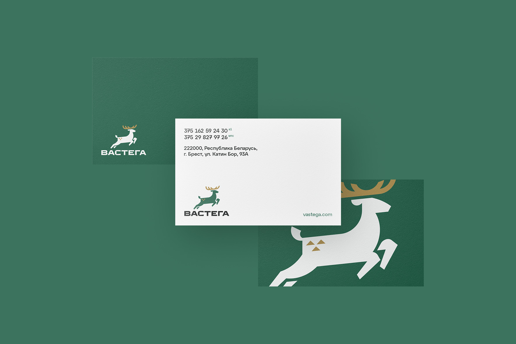
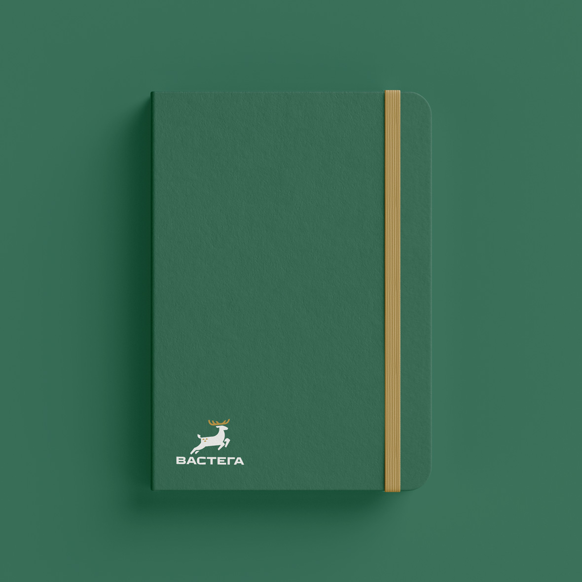
The word «vastega» has its roots in the northern and Siberian regions and means a courageous jump or leap of a running reindeer, made from a run-up and with all one’s strength. The term reflects the strength, courage and determination inherent in a reindeer making such a leap and fully reflects the spirit of the company.
Vastega uses traditional recipes in the production of tinned vegetables. That is why during the redesign we strived not only to modernise the logo, but also to make a reference to the traditional Old Slavic culture. Thus, the precise and clear lines in the image of a deer refer to ancient heraldic symbols, while the strict and confident inscription emphasises the modernity and fundamental nature of the company.
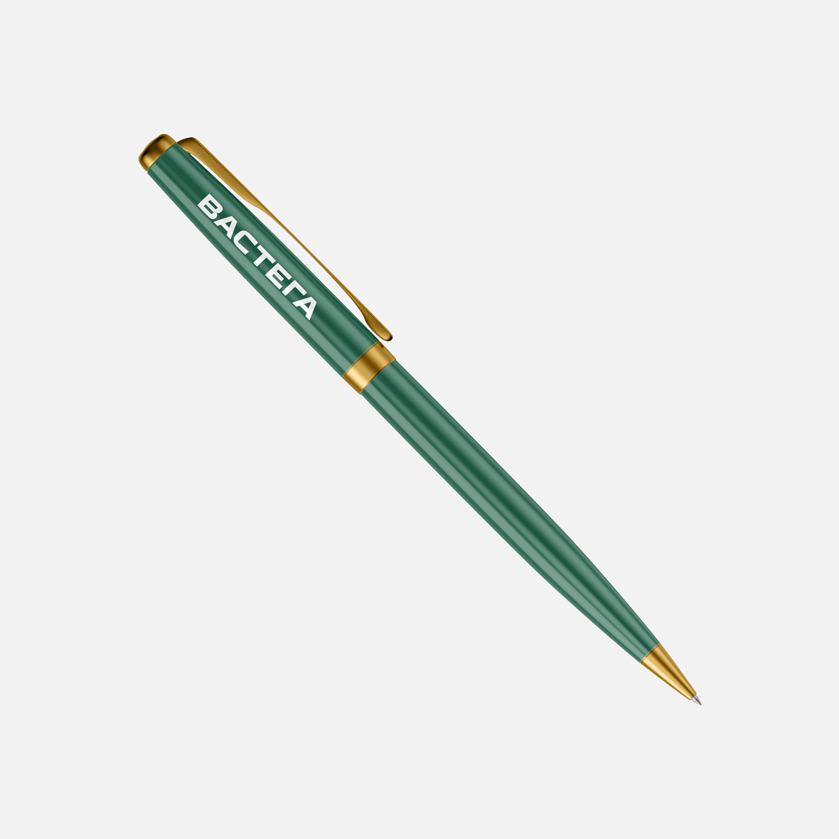
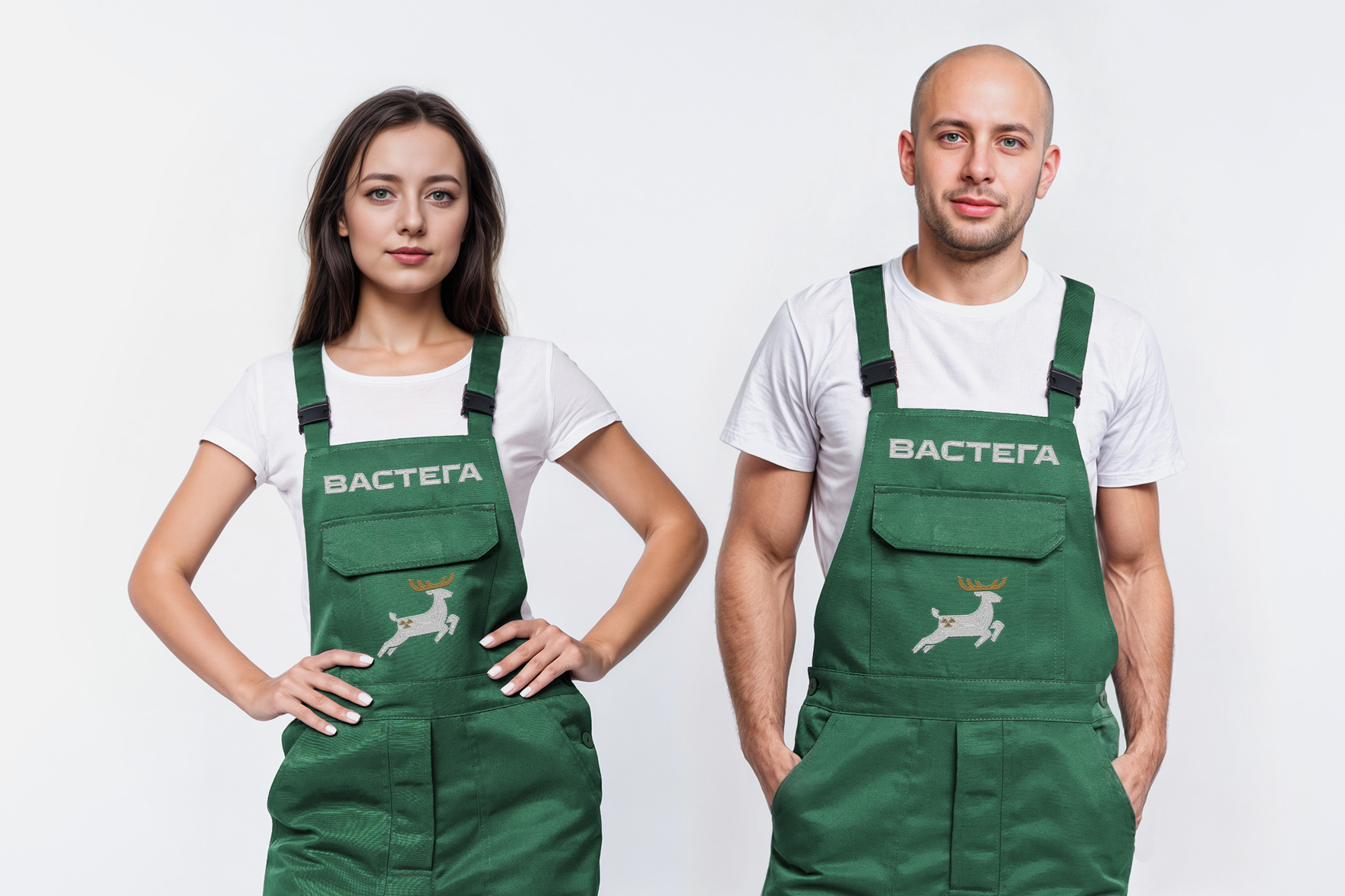
The colour palette includes two primary colours. The signature green reflects the naturalness and proximity of fresh mushroom and vegetable sources, while the gold reflects modern technology and quality control at every stage of production.
Client
Vastega
Services
Corporate branding
Logo
Date
July, 2024


Let's talk business
Fill out the form and we will contact you. As a rule, this happens during the working day.