


Georesin identity
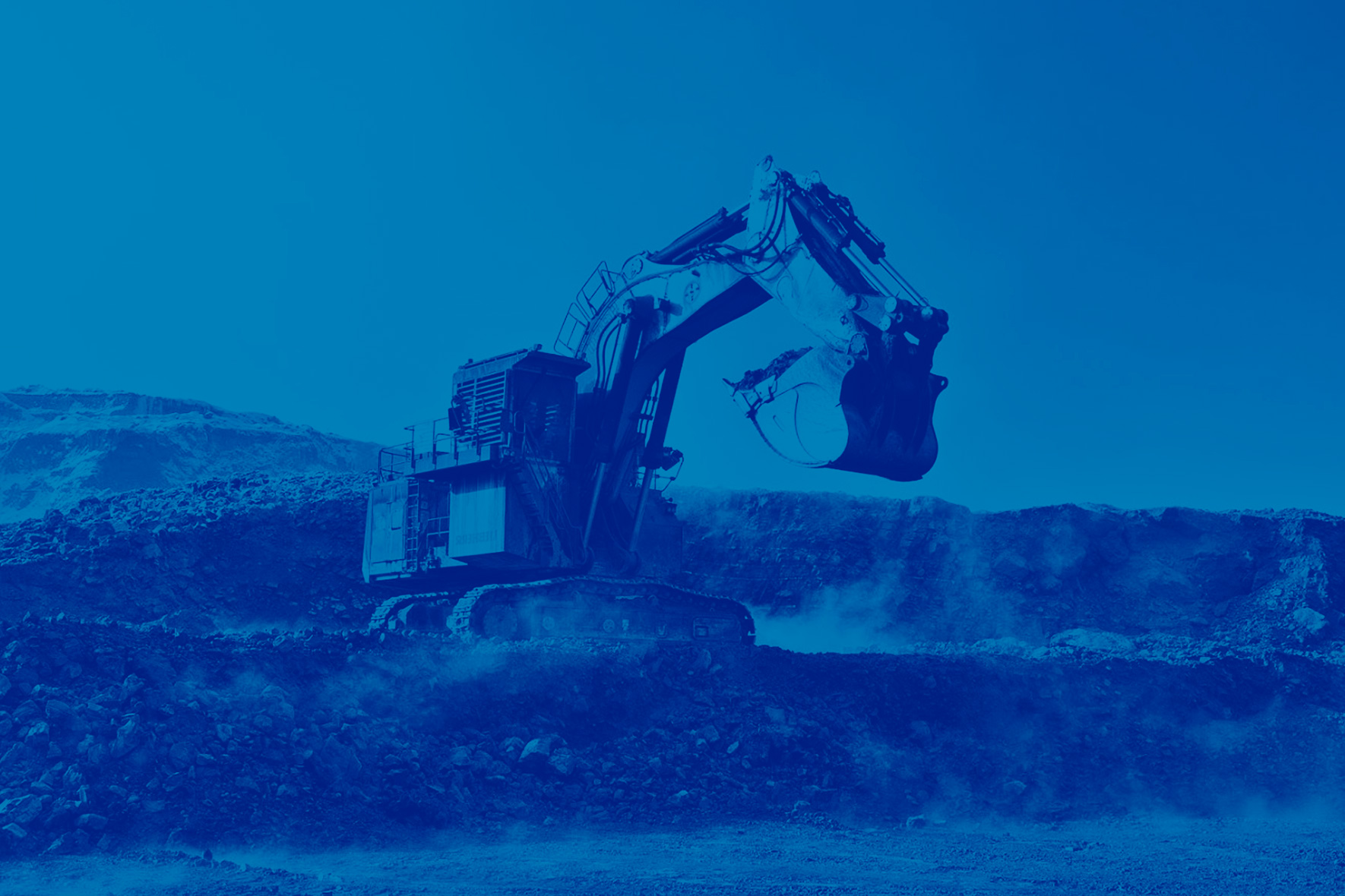
Colors, technicality and innovation
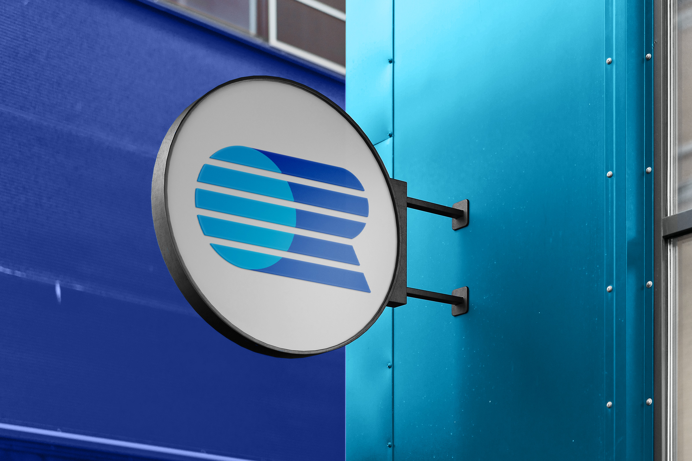
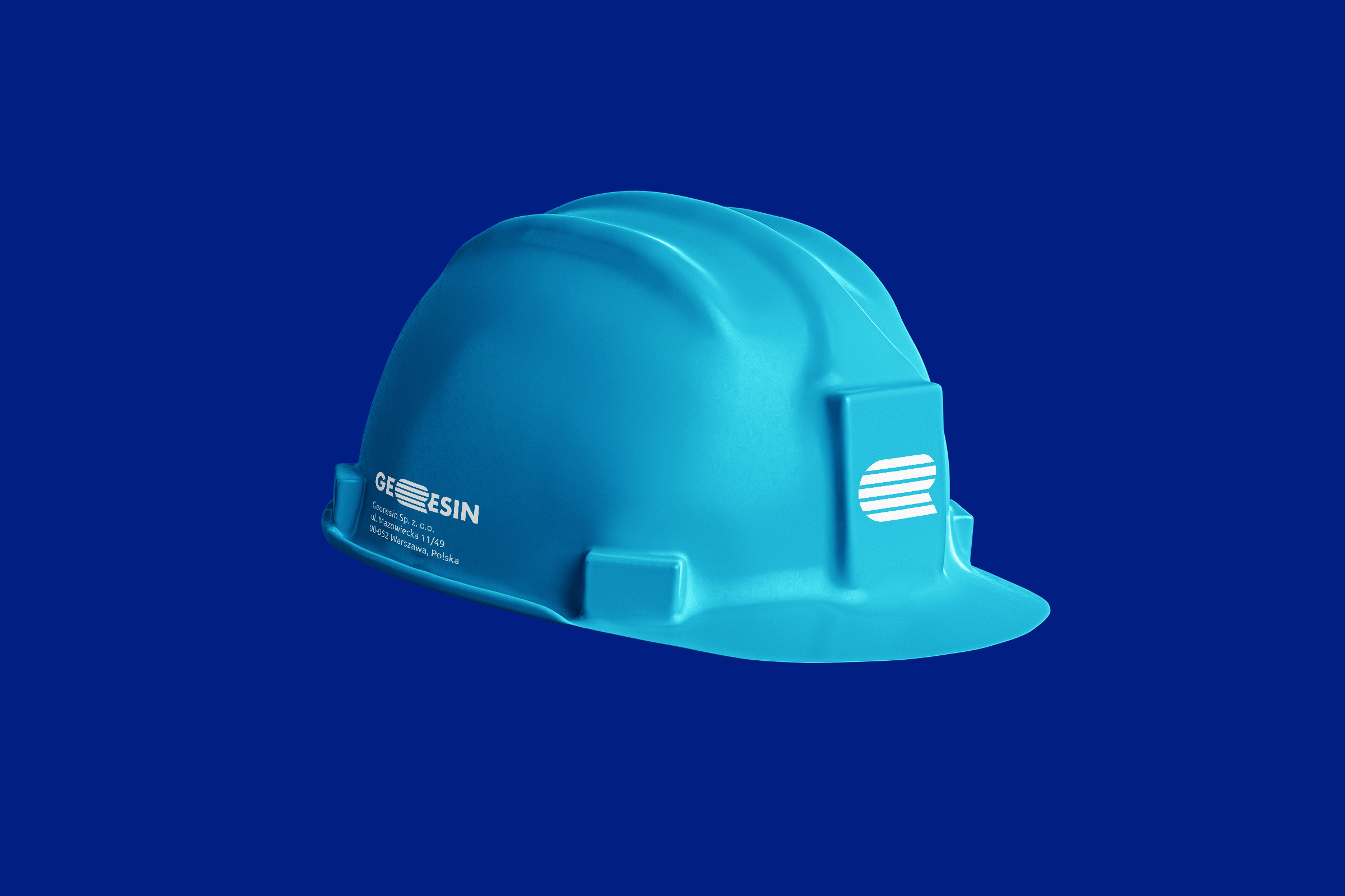
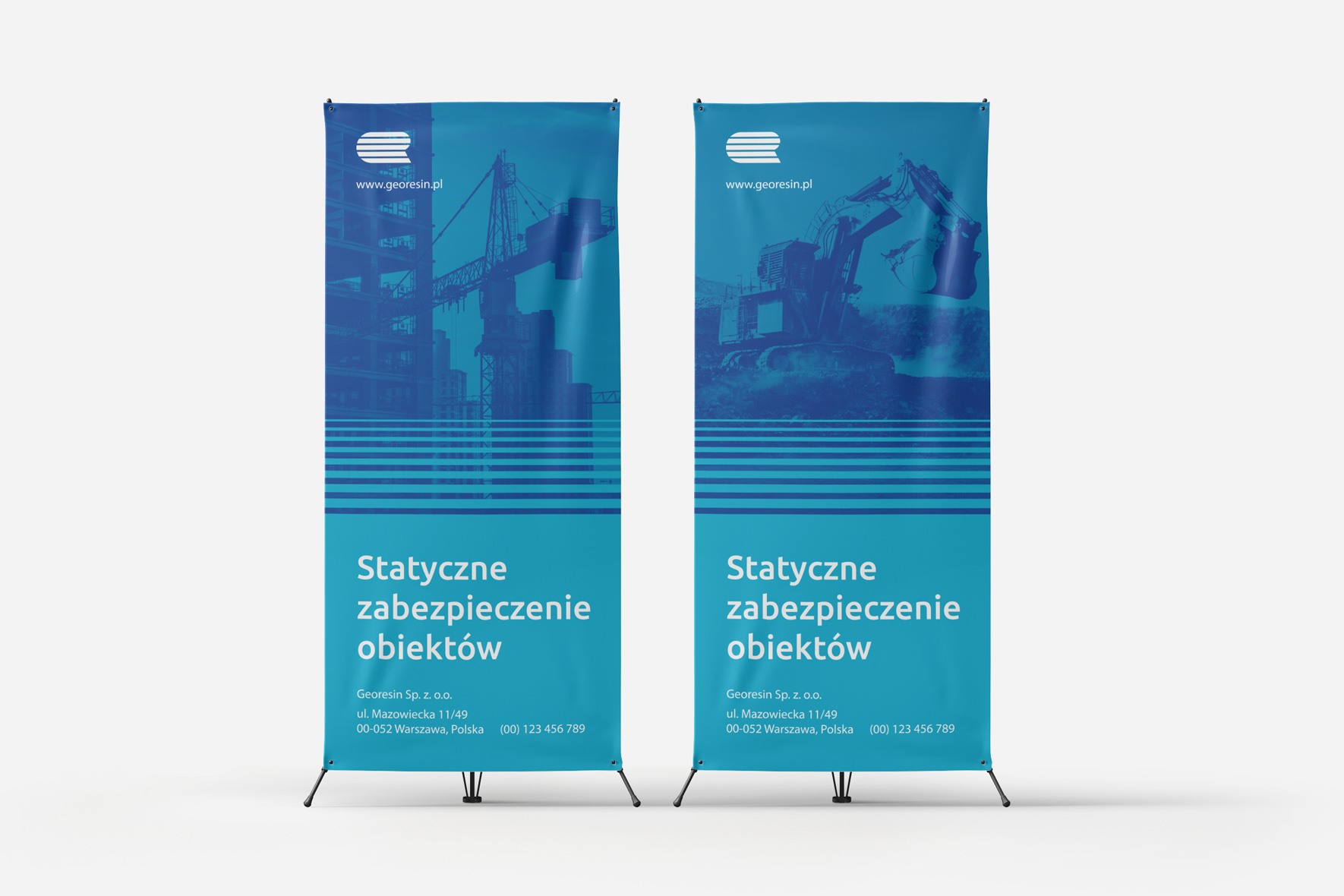
The solution used in the logo, on the one hand, illustrates the land (in ancient Greek – geo), on the other hand it refers to the theme of construction. The horizontally placed blocks symbolize building structures and emphasize the reliability and confidence of the company.
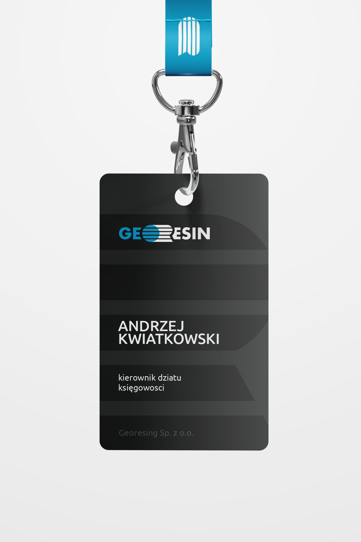
The main version of the logo is made in a cold blue-blue color scheme.
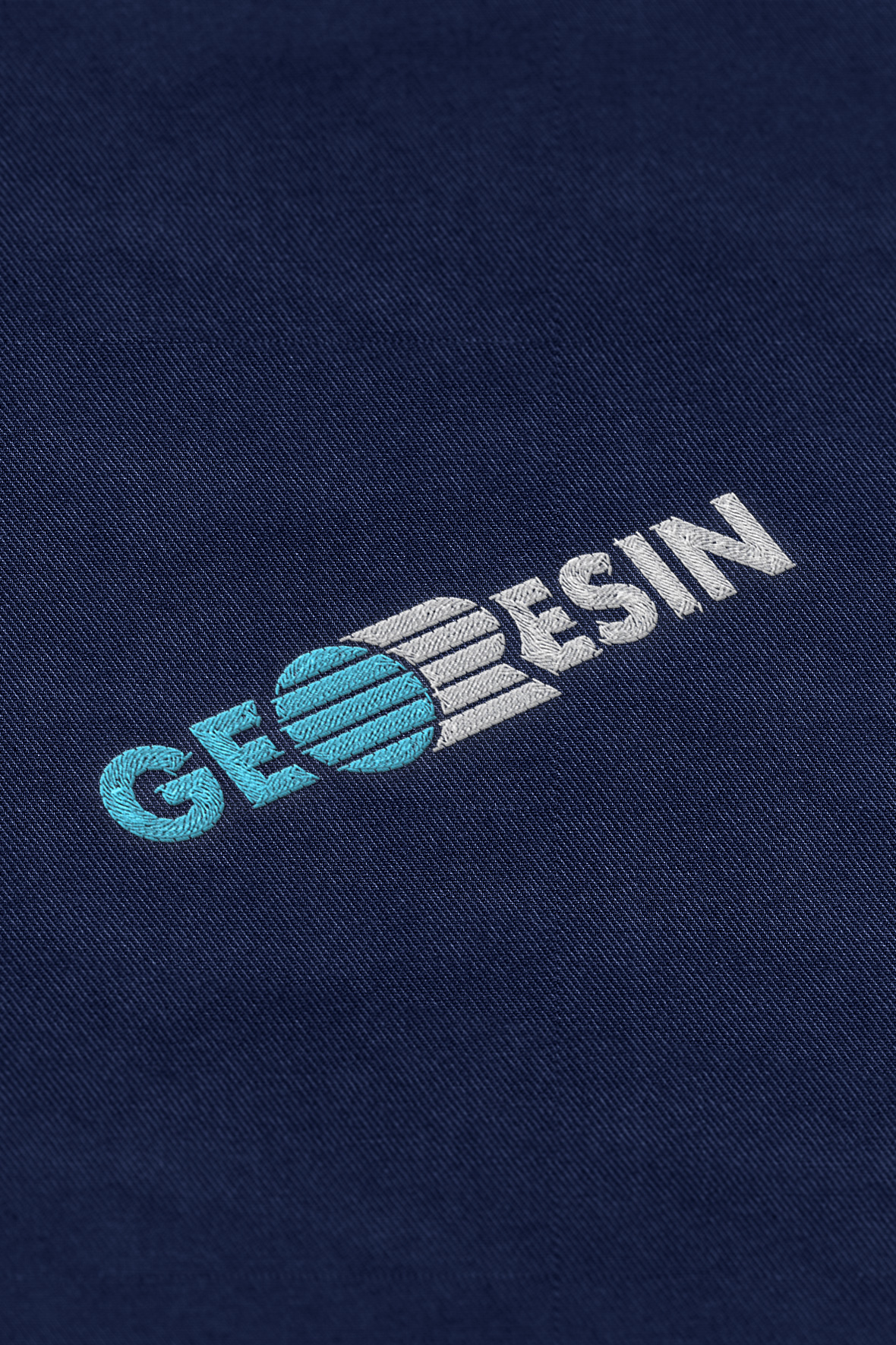
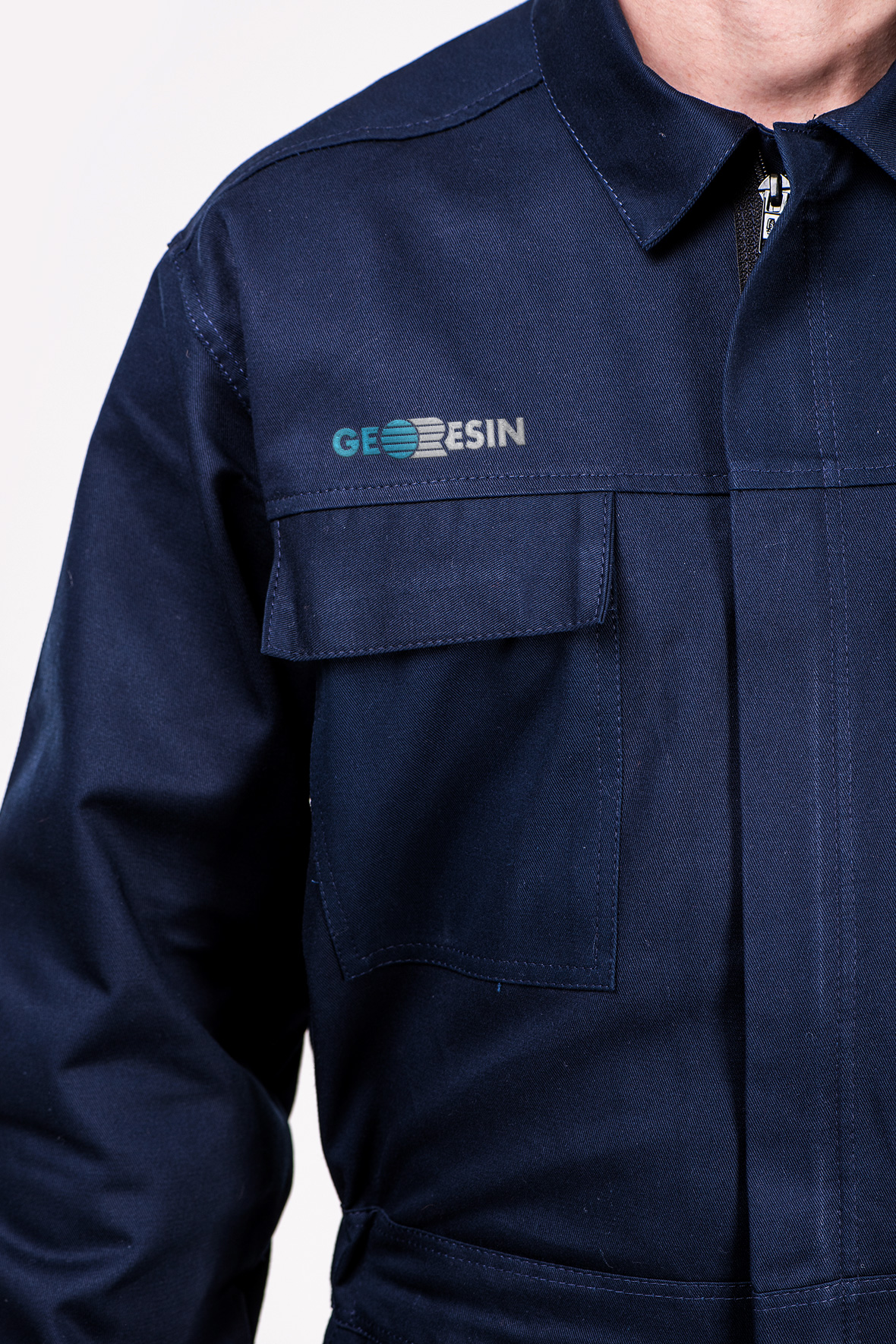
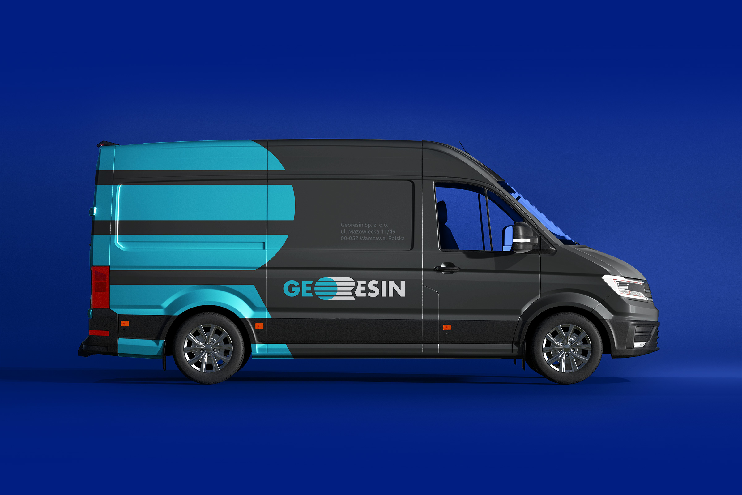
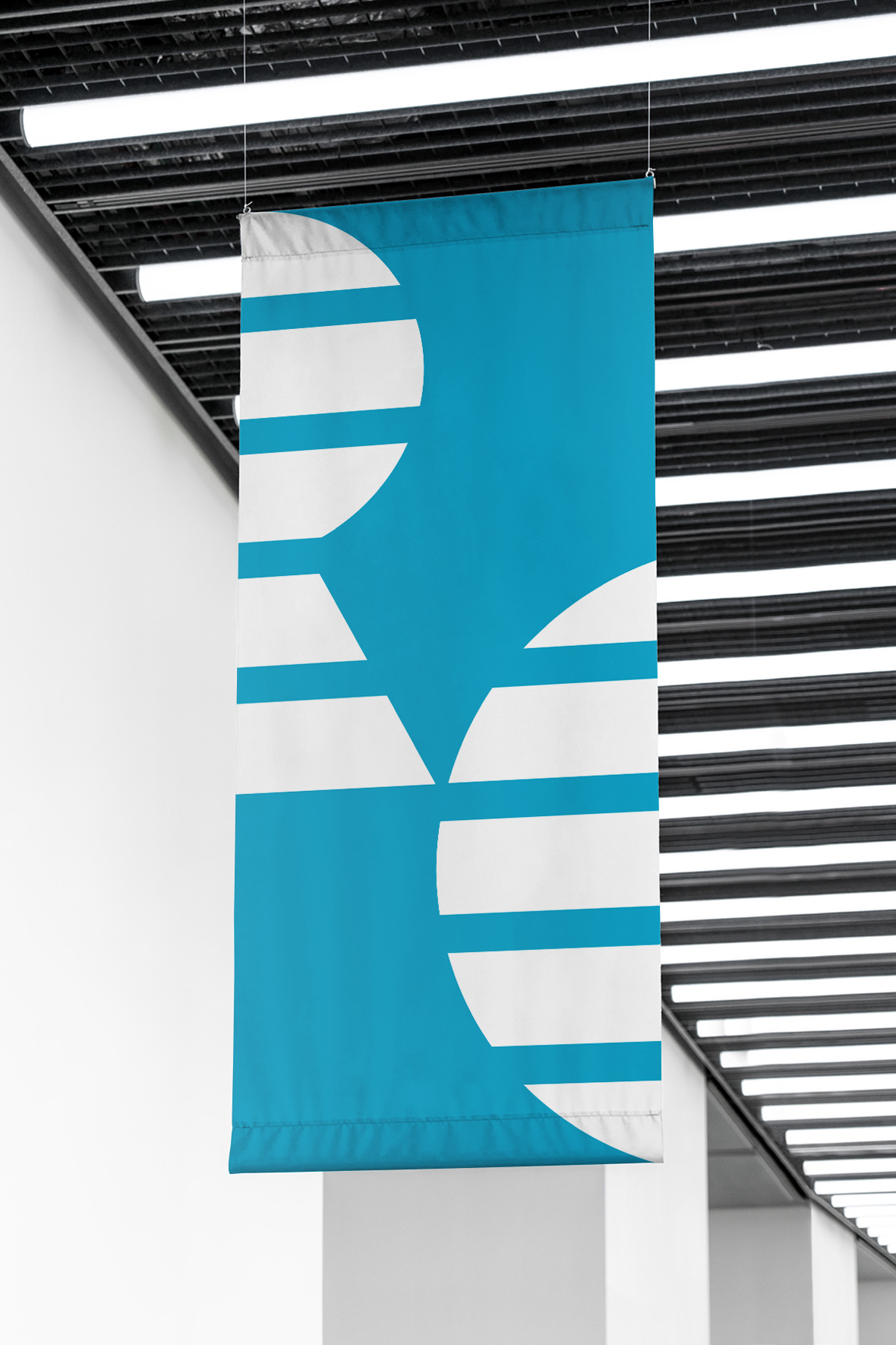
The graphic element looks stylish and laconic, including when used separately from the text.
This makes it easy to brand carriers of form factors with equal or similar in size sides.
Client
GeoResin
Services
Corporate branding
Logo
Identity
Date
September, 2021


Let's talk business
Fill out the form and we will contact you. As a rule, this happens during the working day.