Identity of the Major League of the Belarusian Football Championship

Brand image: recognition, typology, individuality
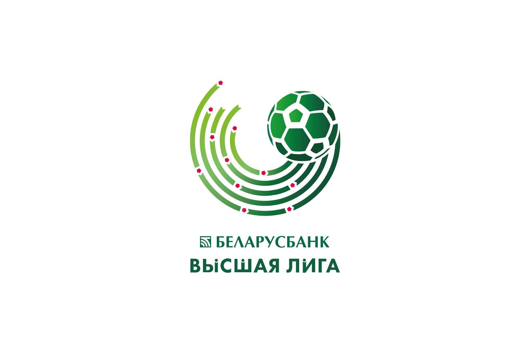
The symbol of the Major League was supposed to retain the traditional football theme and positively gain its own character. Having analyzed the corporate styles and distinctive marks of the world football championships, we decided on the universal attribute of football and similar organizations. The key element of the new logo is a ball in the kinetics of the game.
Movement, development, authenticity
The ball is captured in relief dynamics. In the trajectory of its flight the lines of movement represent a football field with eleven points-players. The color scheme is based on the traditional for Belarus combination of white, green and red, which accentuates the national identity.
In monochrome the logo does not lose its dynamics and is easily recognized on any media. The type part is made using dotted elements in tune with the graphic character.

Concept development in identity — dynamic and rhythmic lines forming a pentagon. The figure is a symbol of a ball and goal net, repeats the component of the dots of the Major League logo.
The lines form a pattern that is flexible and individual for each medium, which allows to design a large number of corporate media, have freedom for design while maintaining the recognizability of the image.


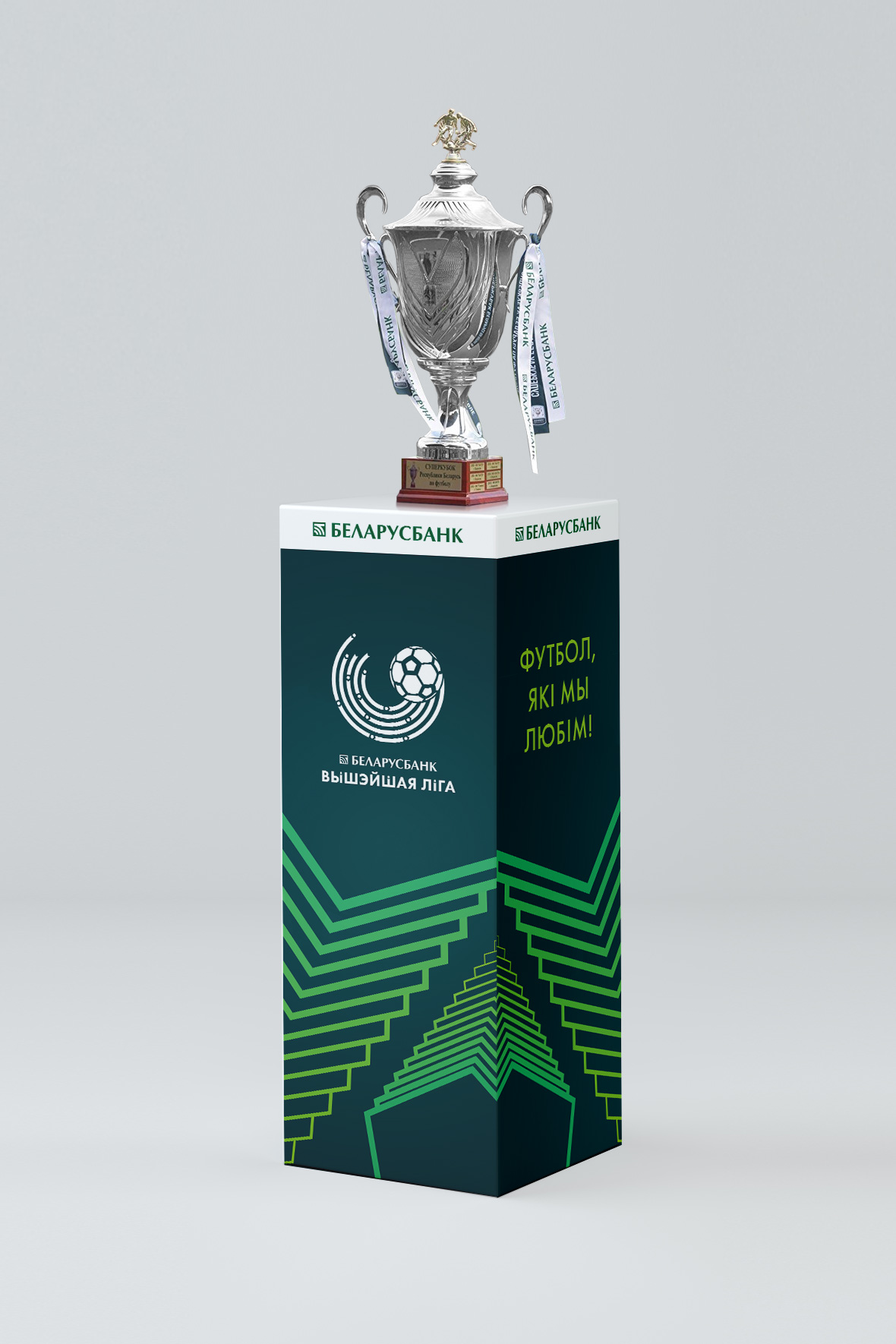


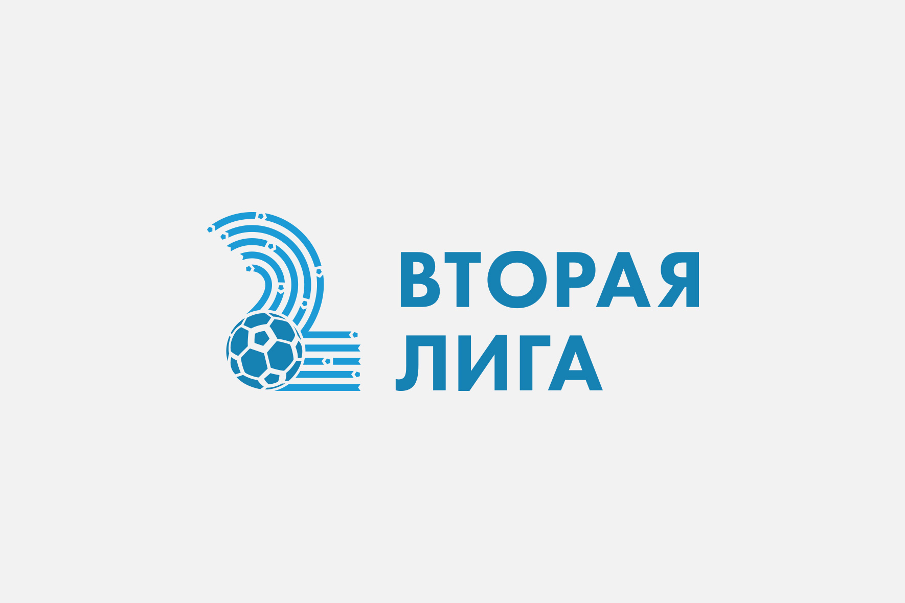
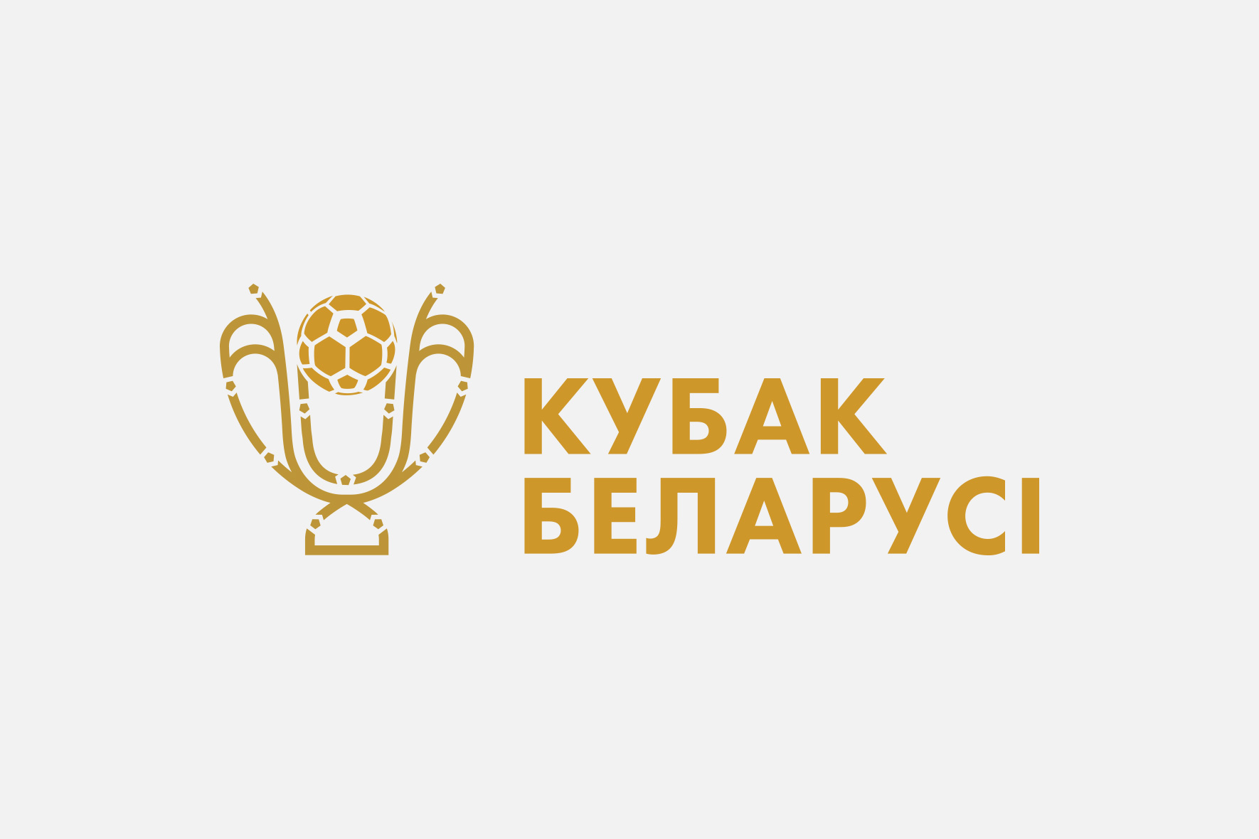
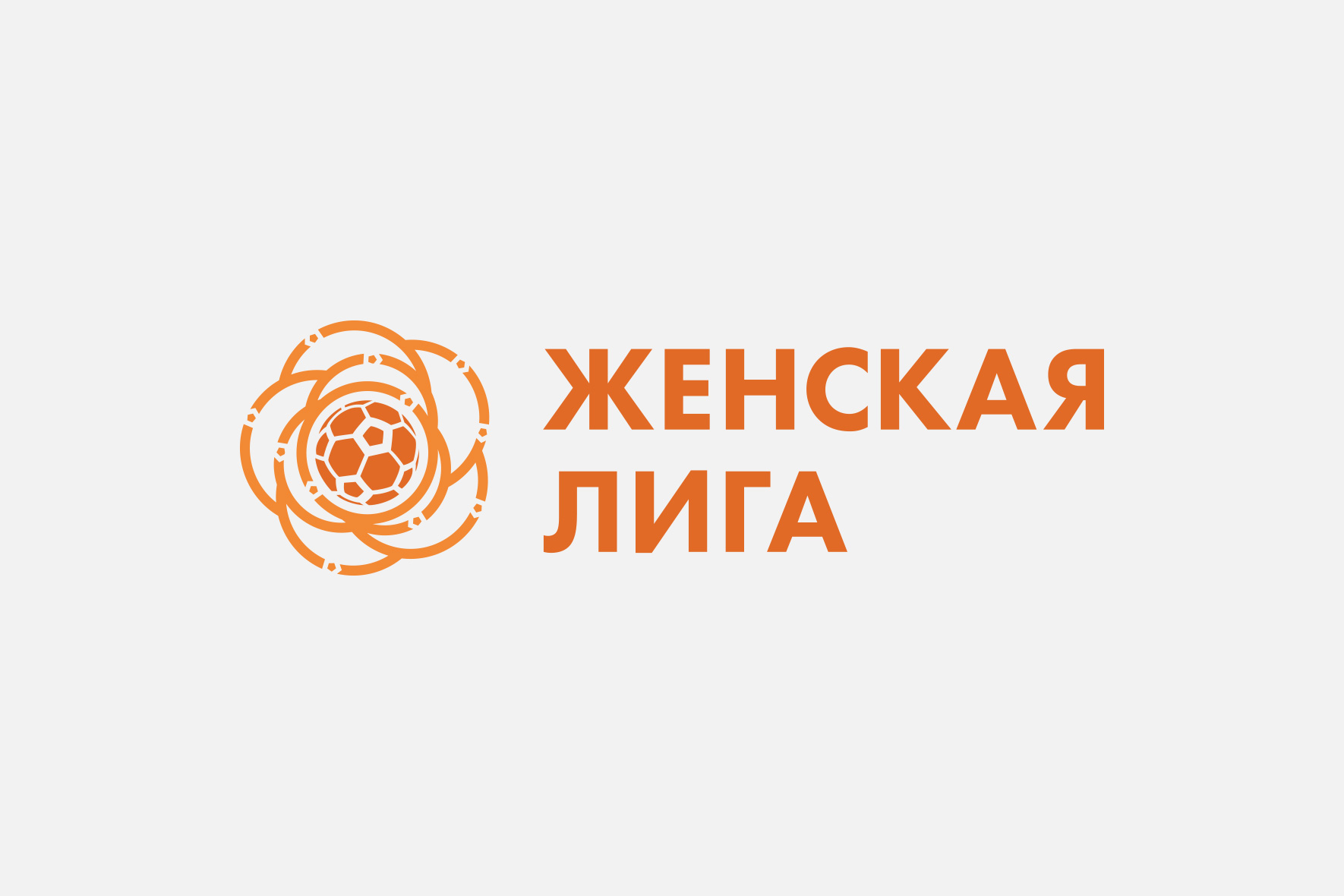
The flexibility and dynamism of the Major League identity is directly reflected in the logos of the First League, Second League, Women’s League and the Cup of Belarus. Each of them has its own unique color code and symbol but at the same time they are all part of a single concept.



Client
ABFF
Services
Corporate branding
Logo
Identity
Date
September, 2021
Let's talk business
Fill out the form and we will contact you. As a rule, this happens during the working day.


